A few days ago I shared some of my woes in trying to get a font that is suitable for my pattern book. Which is a follow up of several attempts over the last few years.
Social media does not have a deep memory and it is hard to repeat a post too often in a short space of time as then the risk is that it will annoy and thus be forgotten even sooner. Except for the feeling (anyone want a post on how emotions drive SM content? I’ve got years of experience that matches various peer reviewed papers!)
I got feedback earlier the font was too small, that was perfect! I already have that as part of the desired list of things to modify! But I’m struggling to get feedback on other aspects of the fonts that are tricky.
Is it the serif (flicky bits)? Is it squareness of round letters (o e a p d etc.) Is it line height? Spacing? Letters too similar to each other? Unfamiliar special letters?
I am trying to get feed back on the font as it will entirely transform my book. Entirely. En.Tire.Ly
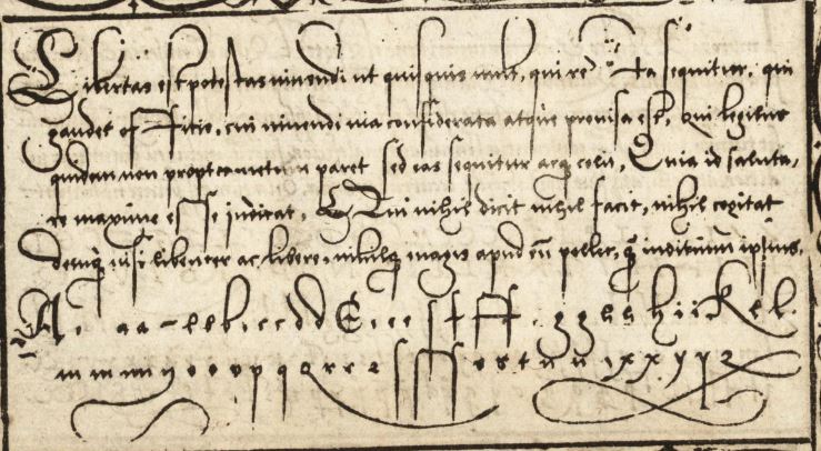
I shared a bew links including this book of script writing from the 1560s:
Examples of the script I try to read in formal documents (ish) https://archive.org/details/gri_libellusvald00wyss/page/n77/mode/2up
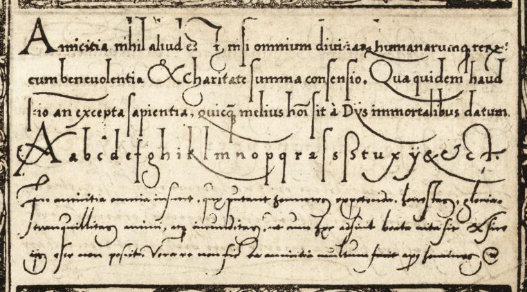
I like this font https://archive.org/details/gri_libellusvald00wyss/page/n59/mode/2up
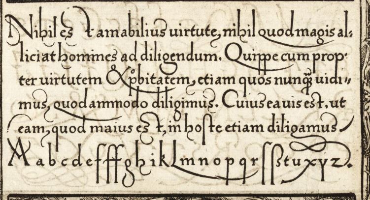
So, region appropriate examples of printed work:
Quentell (Koeln! My ideal)

Cook book, Anna Weckerin

Seimachen modelbuch

Hoffman modelbuch

Shoen modelbuch

French text Quentell

I can read all of this, but the way I do is to not skim like I often do in my own language, so I focus on the individual words and that also means I look at each individual letter, less scanning in context of each line which I usually do to get an idea of where a sentence is heading.
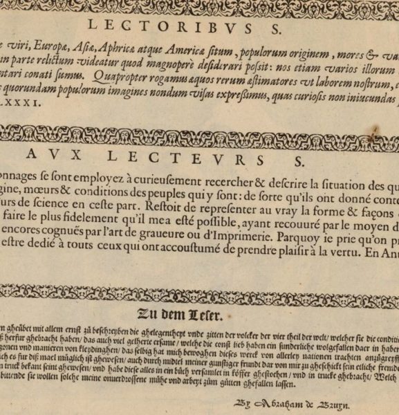
So then there is the Antwerp press. With the super handy de Bruyn books:

The introductory pages are translated and use fonts immediately recognised for each language:
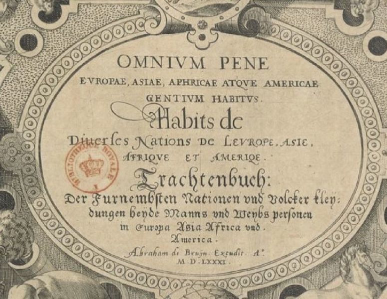
Boissard does the same.
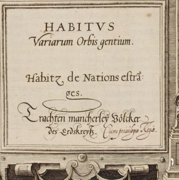
Though internally one font for latin, french, and german:

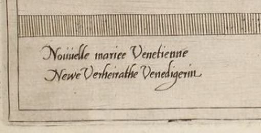

I like this font for say.. a printer who maybe got hold of a book and copied it… This is very common for the modelbucher! But plates of clothing were also copied across many printers
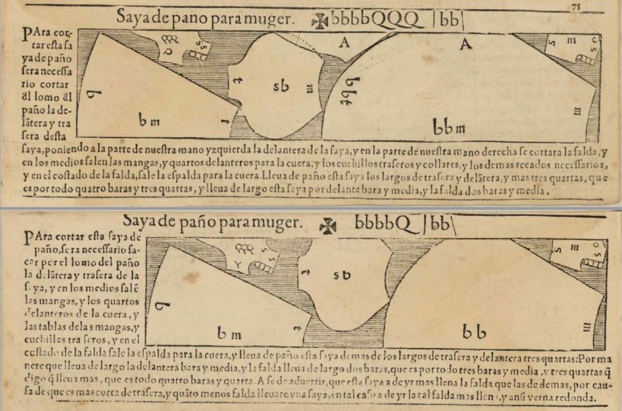
But what people are most familiar with and can read most easily are the printed Spanish books:
Alcega 1580 (shape of book is not what we are used to)
But the pattern books we have from the North are hand written and so are very very very different.
1540 (later copy?)Schuster

Not going to pretend I can read all of this, I can read “lang” for length. But the font has a character I’d like to try for.
So, to that end I have gone on a font hunt spree!
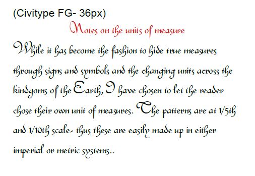
1: Civitype FG
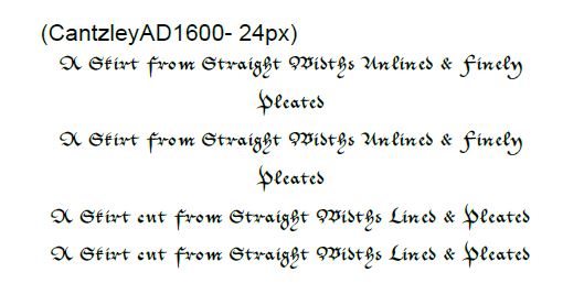
2: CanzleyAD160
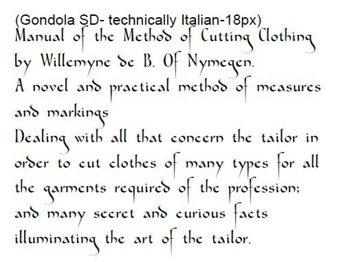
3: Gondola (might be a bit open.)
4: Italian Cursive- similar to de Bruyn et al.

5: CalimaDB Also similar to de Bruyn

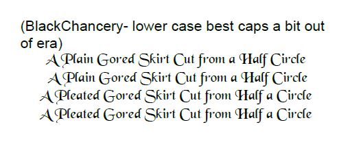
6: Black Chancery (lower case very clean)
7: Matura
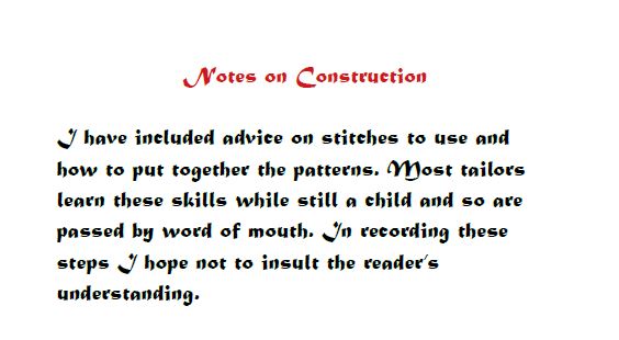
8: Kanslei Script HJ2

9: Kanzlei
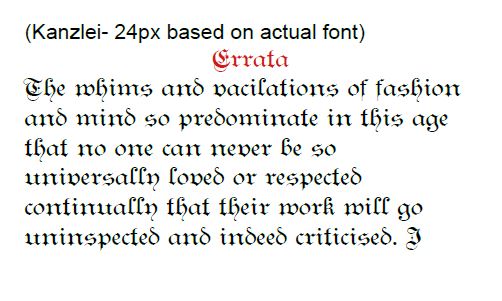
10: CAT Franken Deutch

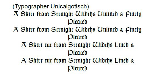
11: Typographer Unicalgotisch
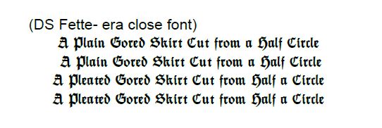
12: DS Fette
13: My Electronic Schwabach
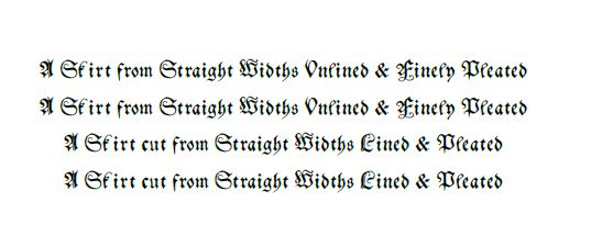
14: alte Schwabacher
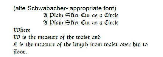
15: Schwaben Alt
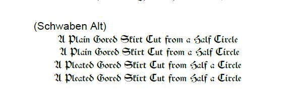
16: fin-fraktur (y looks like an n)
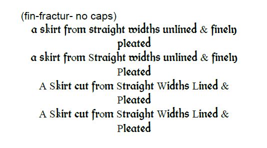
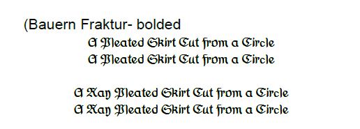
17: Bauern Fraktur
18: Kleukens Fraktur
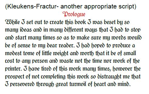
My hope is to make it a printed work to include this utterly ridiculous passive aggressive prologue as so many books have this. I want to be able to include a quote from a patron.
If I go for a hand written book I can include an “insert” type of introduction as you often find manuscripts taken apart and put together again with new context.
I’m currently working on the pattern plates to get very clear accurate lines that can then be processed in another program to fake print marks or maybe ink blots.