Studies in plain needlework and amateur dressmaking .

Studies in plain needlework and amateur dressmaking ..

by Ross, Harry A., Mrs. [from old catalog]
Published 1887 Topics Sewing, Dressmaking Publisher Battle Creek, Mich., W. C. Gage & son, printers
Pages 56
Possible copyright status The Library of Congress is unaware of any copyright restrictions for this item.
Language English
Call number 9622452
Digitizing sponsor Sloan Foundation
Book contributor The Library of Congress
Collection library_of_congress; americana
Full catalog record MARCXML

Instructions in dressmaking, basting and fitting

Instructions in dressmaking, basting and fitting

by [Moschocowitz brothers, New York] [from old catalog]
Published 1884 Topics Dressmaking. [from old catalog] Publisher [New York
Pages 40
Possible copyright status The Library of Congress is unaware of any copyright restrictions for this item.
Language English
Call number 8222341
Digitizing sponsor Sloan Foundation
Book contributor The Library of Congress
Collection library_of_congress; americana
Full catalog record MARCXML
This book has an editable web page on Open Library.

Sadly only a single image of line art is included

books galore and well..

So my books are already winging their way from Central Basement (where all the cool books live.) and I did fond at least one maybe two online references from the Worth bibliography.

Still no sign of The cloud pattern nor The ray pattern. There are stars though (yuss!!) but the clouds prove elusive.

And then I saw an ad on facebook.

How To DIY a Balloon Garland

And this is lovely, I’ve seen them before and like the idea of one like this with pastels and…..oh dear.

I can no longer unsee.
 

No but seriously the cloud patterns used on other garments use tapering scrolling shapes. So the hunt for the original design continues!

the source I was looking for

Sorry about weird auto-formating. Apparently facebook uses a lot of div elements!

I did this morning find the original quote in all the books I was reading in regards to Worth having a mix and match pattern catalogue.

The House of Worth.

Language(s): English
Published: Brooklyn : Brooklyn Museum, c1962. —
Subjects: Worth, Charles Frédéric, > 1825-1895.
House of Worth (Firm)
Costume designers > France > Biography.
Fashion > Exhibitions.
Note: “An exhibition held at the Brooklyn Museum from May 8 through June 24, 1962.”
Physical Description: 56 p. : ill.
Locate a Print Version: Find in a library
Viewability:

Full view (original from University of Michigan)

Link directly to the source!

If one approaches those Worth gowns that have survived the years with a tape measure and the eye of a pattern maker, one may glimpse Worth’s flair for engineering. His gowns were made of many standard interchangeable parts. One sleeve may fit several different bodices or each bodice will fit a great variety of sleeves. In turn, each bodice may be joined to a host of skirt shapes.

This sounds reasonable, but the two dresses the book that are compared really don’t show this- the draperies are pointed out.

The most interesting aspect of Mrs. Drew’s gown, however, is its illustration of the many ways Worth repeated a pattern. The diagonal swags of the skirt are the same as the drapery trimmed with pleating on the voile dress pictured on page 29 of this catalogue. They are also identical, even to the fringed button trim, with another dress of green taffeta dated 1876 in The Brooklyn Museum collection. It would seem that plus c’est la meme chose, plus ca change.


Not seeing any similarity in regards to the drapery, but perhaps that is due to owning a surfeit of images from the 1870s and 1880s- variations on a theme really was the fashion.

However I have definitely fallen head over heels in love with a particular gown that was made over and over and over again. It’s middle of the 1890s, ball gown. There is one with woven butterflies all over an aqua silk satin, there is one in pink satin with wheat sheafs in beads and sequins up the skirt, there is one in turquoise velvet. They have a slightly asymmetric neckline and are possibly underappreciated because they seem so plain.

In London’s Victoria and Albert Museum is a series of sketches of an 1860 skirt showing the imaginative variations possible with a single basic shape. Made up in a diversity of fabrics and the multitude of trimmings so favored by the mid-century mind, one can envision an almost endless series of dressmaking permutations.

I may not totally see the link above to the idea of mix and match, nor here, but I do see how a skirt would be the primary focus. The 1860s skirts were a huge canvas, and bodices of each decade were built on specific lines. So deciding on a skirt then making the bodice(s) match is very sensible. The opposite of what I tend to do as I tend to work in vertical lines from shoulder to floor.

But the en disposition gowns of the 1890s are most definitely not created this way, they are deigned to match the fabric. The construction of each cannot be swapped.


Again, I think the inconsistency in our views of Worth have a lot to do with how long the house was in operation and how the different styles were not simple changes but involved new practices from design through construction through fitting.


Fashion magazines

Many more fashion plates in context! Some of these have made their way into cosutme history books.

Of interest to me is how much pink there was in the 1870s! So much. It’s quite… fashion doll pink in plates but I have some paintings where it’s much softer 🙂


I have linked to the about pages in each case, click the book cover then the thumbnails icon to be able to see at a glance how much information there really is! Some of these came with pattern suppliments, it’s a pity these have simply been scanned to show that they exist but from experience of scanning my own magazines they are on webarchive) it is a big ask as it is!


Le Moniteur de la mode: journal du grand monde ; modes, illustrations, patrons, littératures, beaux-arts, théatres.

1874

Revue de la mode: gazette de la famille, Volume 1

1870

Les Modes parisiennes:

1872&1

Journal de Demoiselles

https://books.google.co.nz/books?id=kBxfAAAAcAAJ&source=gbs_navlinks_s

1874

https://books.google.co.nz/books?id=HE5iAAAAcAAJ&source=gbs_navlinks_s

1875

https://books.google.co.nz/books?id=r1gEAAAAYAAJ&dq=Magasin+Des+Demoiselles.&source=gbs_navlinks_s

1878

https://books.google.co.nz/books?id=yVkEAAAAYAAJ&dq=Magasin%20Des%20Demoiselles.&source=gbs_similarbooks

1881

https://books.google.co.nz/books?id=x_wGAAAAYAAJ&source=gbs_navlinks_s

1883

https://books.google.co.nz/books?id=71gEAAAAYAAJ&source=gbs_navlinks_s

1884

the books arrived

While I was at the library the Ultimaker was also there XD It felt brilliant being able to talk historic costume nerding while also talking about the printer and the software to use it. Just fun 🙂 Also it’s a nice size machine so seeing it in person means potentially being able to plan to get my Maleficent horns printed piece by piece.

Anyway, I know the Opulent era well but it’s still really nice to have the luxury of having it at home. Also this is still a gown that keeps leaping up for attention:

http://www.metmuseum.org/art/collection/search/155944

Date:1900
Culture:French
Medium:silk, rhinestones
Credit Line:Brooklyn Museum Costume Collection at The Metropolitan Museum of Art, Gift of the Brooklyn Museum, 2009; Gift of the estate of Mrs. Arthur F. Schermerhorn, 1957

My scanner has fallen over but The Opulent Era has a strip photo of the beading and it is just clear enough to make out the bead types 🙂 Looks like delica style pearelscent bead which is fabulous! One of the desriptions in the Worth Bio mentions “iridescent” beads which I always take to mean opalescent- rainbow refracted colours very pearlescent but either is of interest to me in terms of materials. I adore AB finish so figuring out an appropriate start date to use it is always of interest.

As a start:

http://blogs.houseofgems.com/index.php/2014/09/sparkle-shine-a-brief-history-of-how-glimmering-gems-and-beads-came-to-be/

Metallic sparkle and shine has long been a favorite among bead connoisseurs. The bead makers of Gablonz first painted metallic finishes on glass beads, including iridescent coatings. Next, they came up with iridized and electroplated glass beads. Iridized glass was glass sprayed with an almost hair-thin vapor deposit of metal oxides. The craze for iridized glass and beads reached its height during the late 1800s and again in the 1950s and 1960s after the introduction of aurora borealis coating.

http://www.karipearls.com/how-pearls-are-made.html

Wax Pearl with Essence Coating and Fragile Glass
Photos thanks to Diane Volkmann

Which I had only heard about, so it’s nice to see (click through.) For an example of the description of this kind of fake pearl:

MAN and SHELLS Molluscs in the History
By Riccardo Cattaneo-Vietti, Mauro Doneddu, Egidio

Though I think this has the closest explanation:

https://www.thespruce.com/stones-in-vintage-costume-jewelry-4026020

Saphiret is type of glass stone with a blue-brown hue used in Victorian jewelry.

This page also distinguishes carnival glass from AB (specially Swarovski method) so I think this one is the lead 🙂


Anyway. My desire for iridescence is generally tempered by being sure it’s slightly out of date for my most loved eras! But

gathering materials

Well dye remover. I decided rather than trek across Auckland for dye remover I’d just order some. So I did, and ordered a new cutting blade for my cutting machine at the same time because well I’m going to finally just start cutting the darn Elsa sequins! Well huge confetti circles that are 1″ across 🙂 They are translucent so once dye up will be very icy when finished 🙂

The dye remover is for my silk satin and also for something else I have forgotten.. whoops!

But I have also just spent the day detangling my very expensive lace front wig I bought for my Chistine Daae costumes.

It’s a bit frizzy for that now but ideal for doing all kinds of historic hairstyles which is fab. I just need to run a blade over the ends (designed for human hair these thin ends out and as the frizz sticks out is fairly easily cut out 🙂 )

I have read most of the first bio of Worth I got from the library. The library has two last holds for me: the Opulent Era and The House of Worth : portrait of an archive.

That second one I have not read through yet, obviously I know TOE very well 🙂 This is just saving me hunting out a copy for myself as the costume reference shelf is a little out of hand. Okay, no I do want this. I just want to find a very good quality copy!

I have the large scale edition of Costume by KCI and sadly most of the photos I am interested in were not adjusted for the larger format so are a little blurry. Luckily the section on Japanese influenced western costume is all good!

Also.

I’m buying the freaking Rocailles. I may as well do this properly if I’m going to the effort of removing all the dye then adding more. And if I have 10m of silk chiffon already decoloured just for the selvages and.. well this is the gown that started the obsession. And yes, the museum catalogue includes “metallic thread” so I was right in assuming the outlines were originally si;ver.

OMG!

So obviously the owner being rich and in New York had other worth frocks but WHAT THE HEY!@!!!!


I wish it was possible to know if all these gowns were worn my The Mrs Astor, or if they were collected. But I love her taste. I really do. And I am almost up to this section in the Worth biography so I’ll keep reading and see what the book has to say about the New York social scene. Most of the info is fantastic. Not a lot about the day to day proceedings, but a lot of info I assumed but more as well (1200 seamstresses in the 1860s????)

My OMG moment was false though, a picture of the Electric Light (Worth) gown for the Vanderbilt party  came up and I thought how could I possibly have not made the connection. And now it turns out I have lost my book with the very good copy of it.. Anyway. False Excite.

So next step is to see where the book is and possibly rescue it from the pile of books to donate….

And finally.. did I forget or has The Met released a few books as PDFs?

Haute Couture

Right so yes it is pale green not yellow as it appears in the more well known version of the image. Pale blue would make more sense but what the hey. Probably a case of what worked for the client in terms of colour 🙂

maley horns scan might work

I have been using @Autodesk @AutodeskReMake for a while. Just the free version while I practice how to photograph my models. I think I finally cracked it, and it’s almost certainly going to offer great results once I pay for the subscription and can send 250 photos not just 50 😉


So my very first test.

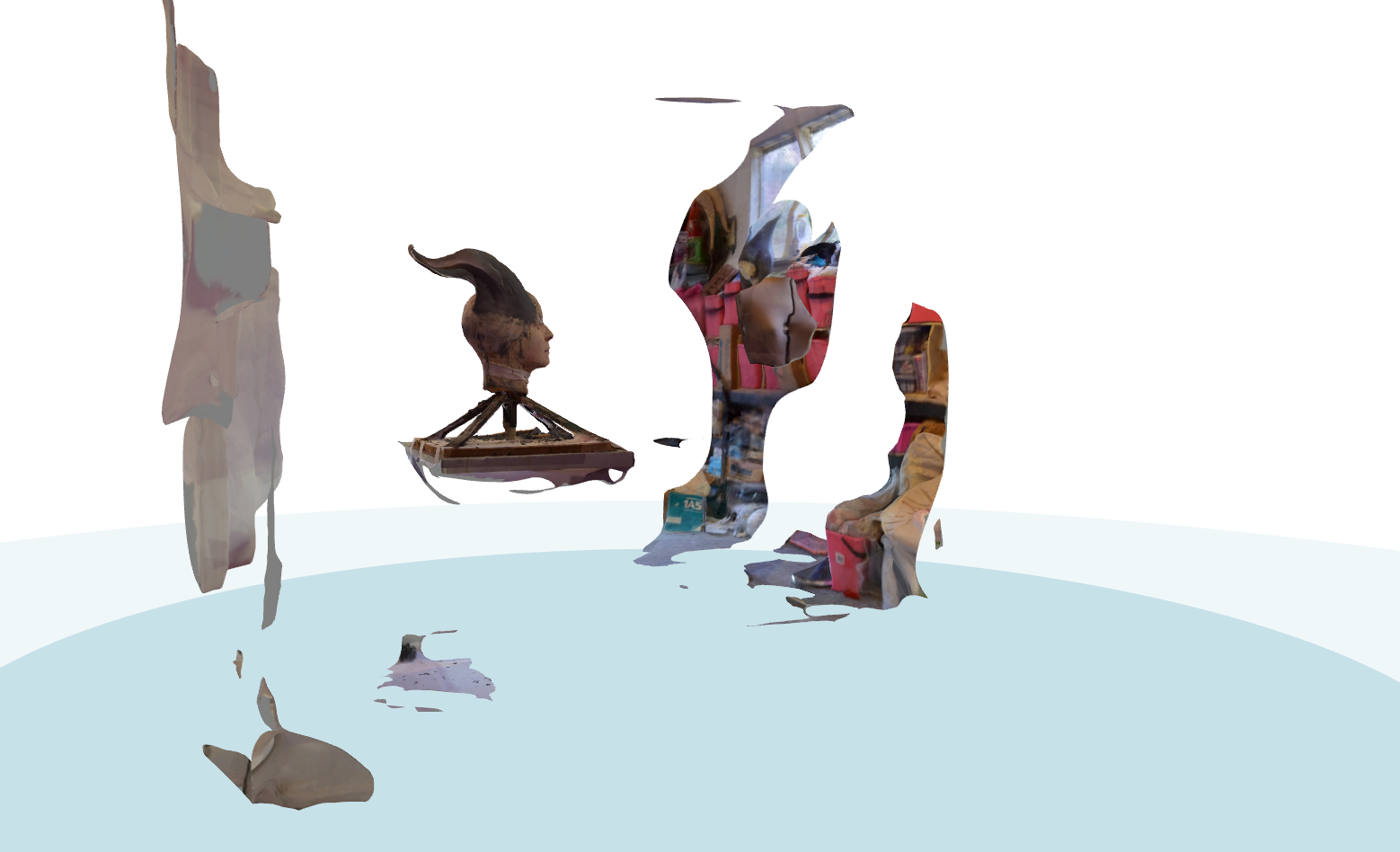
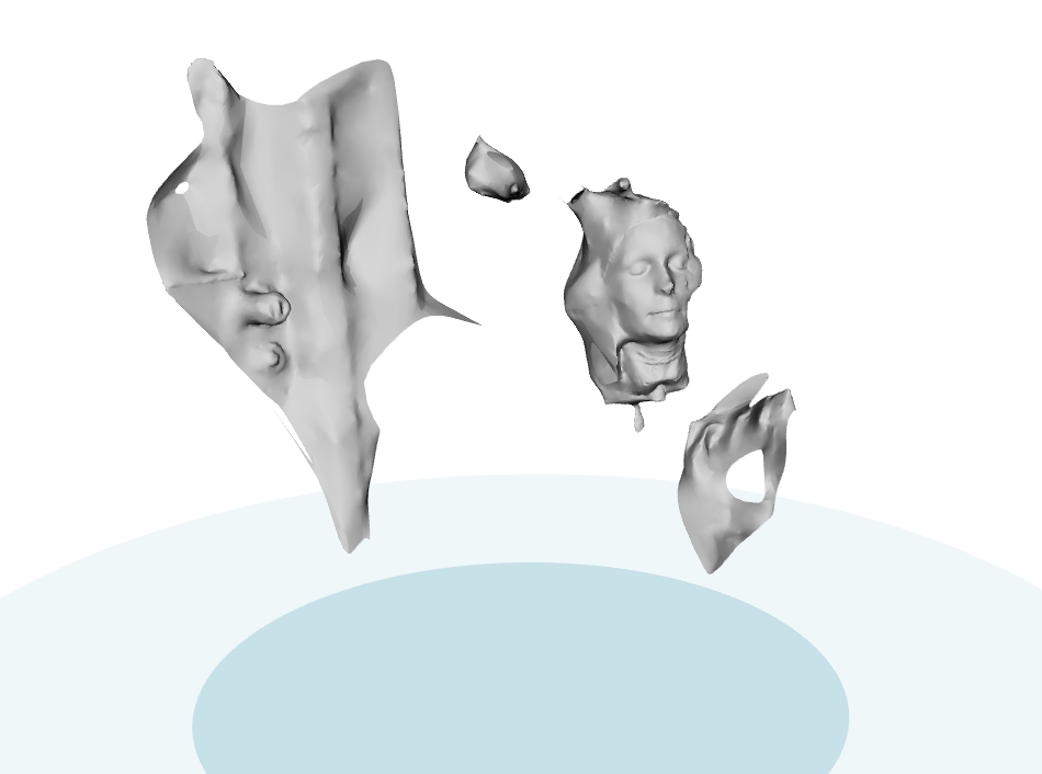
I can’t find my photos but basically I started with the head cast a little way from my far workroom corner and took photos with it stationary.


Looking at the model put out through different angles:

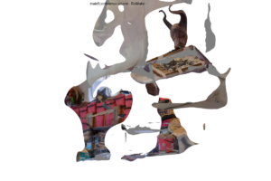
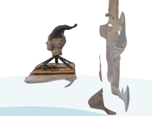
So here you can see the rest of the room was partially captured but the sculpt is well defined.

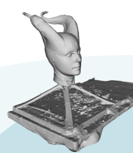
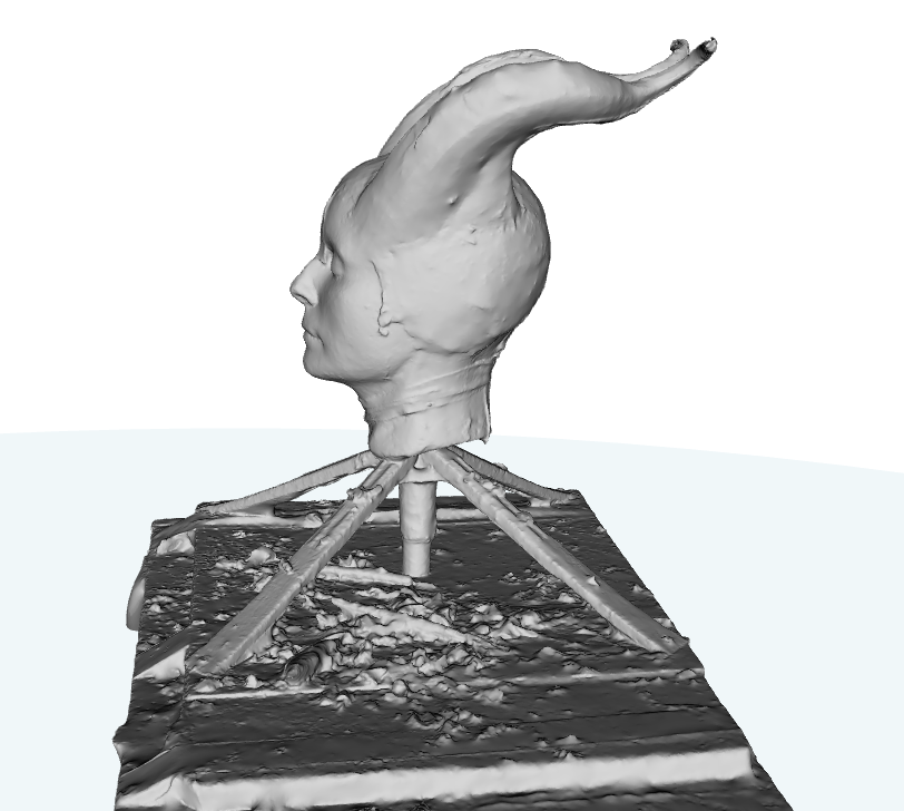
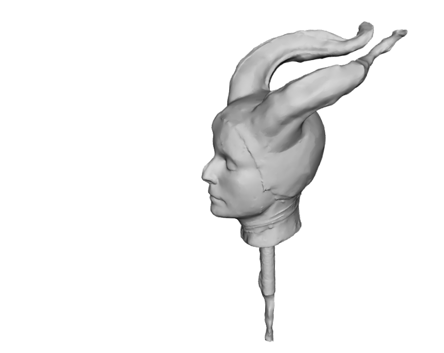
Isolating the sculpt and it’s even captured all the clay shavings! Just a few lumps in the horns but otherwise I’m impressed.

However I was not really able to get close enough in all angles around my sculpt to get decent shots of the underside of the horns.


So I watched a few more tutorials and a few suggested rotating the object rather than standing up and lying down to get angles otherwise difficult.

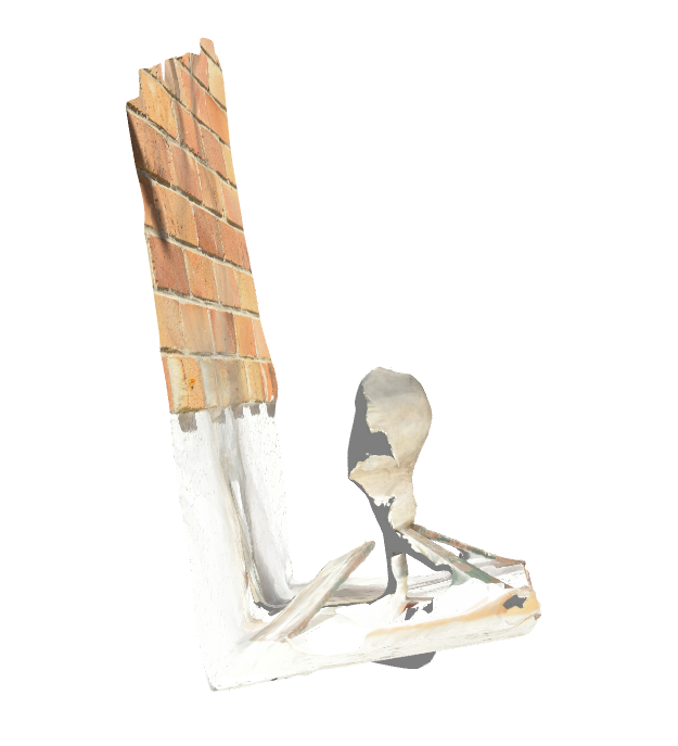
This was in the same place as before. The doorhandle looks mildly terrifying…

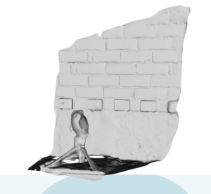
Still on the same stand and this time against a wall in better light. Well I have bricks!

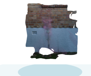
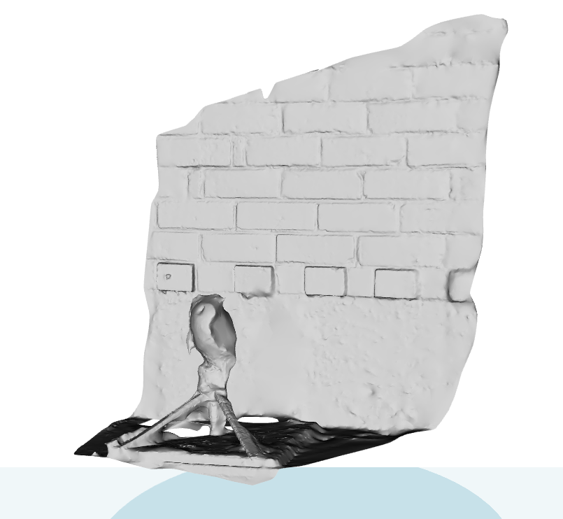
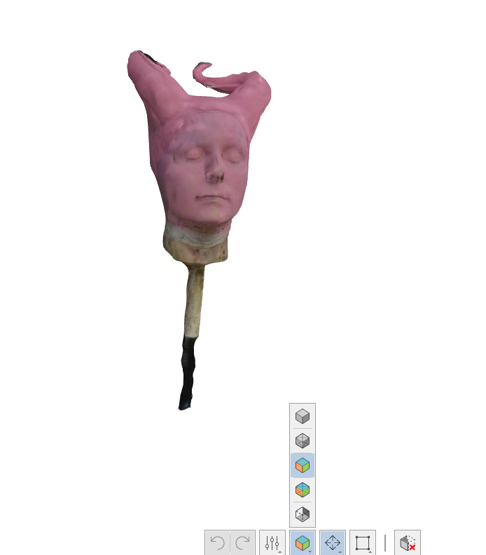
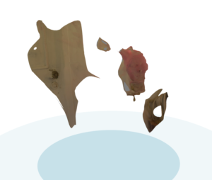
So I painted the horns pink! And put them on a tall stand to really isolate them. Again the horns disappear and there is a great view of the wall.


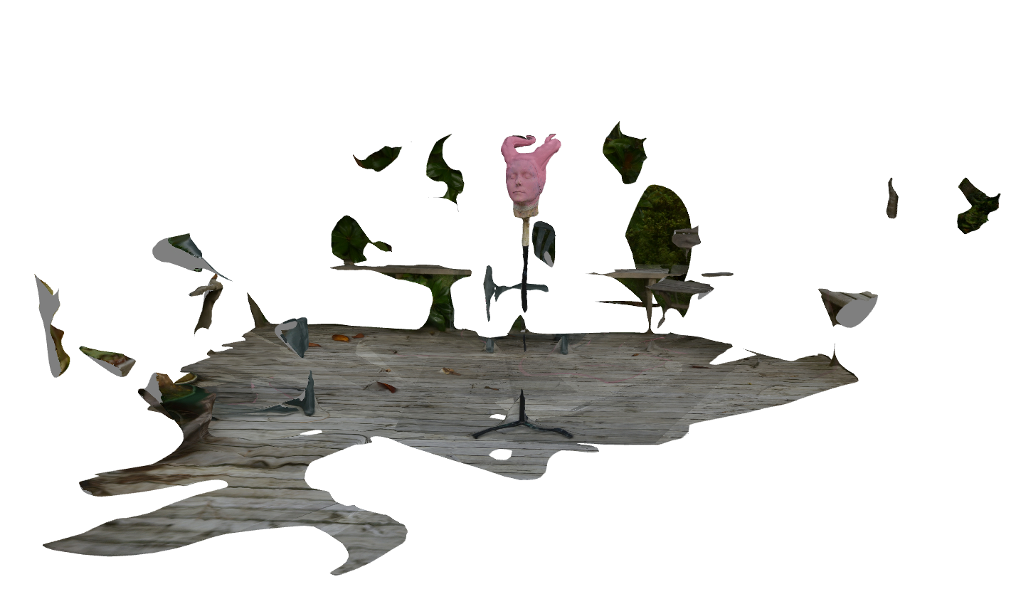
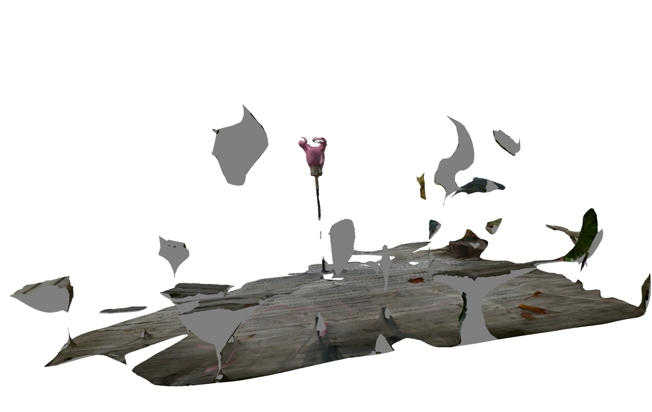
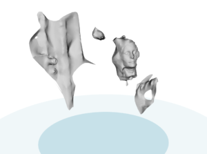
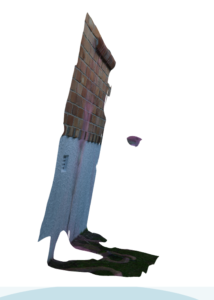
Okay so obviously this sculpt needs to be static not moved around. I realised the back deck is often protected from harsh sunlight but offers good light bouncing from many surfaces. So to the deck with my pink horns on a spike and finally got this:


Lots of background but the horns are easy to isolate.

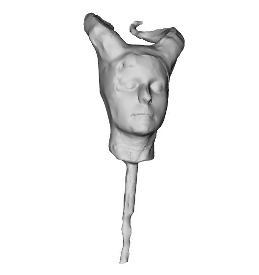
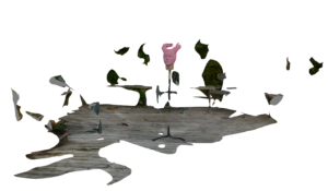
So finally some of the ridge detail is captured! But still quite lumpy.


Each model used the 50 photo limit. I do think with 250 photos I’ll be able to get all the detail needed.


So for a sculpt like this, of complexity of line:

Do make sure the model is static. Do not rotate it for different angles, move yourself around instead.

Get it at a height where you can get images from underneath as well as on top and all around (for me this is about knee to waist high)

Get some photos with the full area around you as that will help isolate the model and put it in context.

Get some mid distance images.


Once those are done you can get in close. I have to reset where my camera focuses because I got a few where the point was on the deck.


But yes. I’m going to set up a few sculpts outside so I can digitise a good number of them. Shae for one, old Maley horns for another. And I’ll melt some clay and pour into some other molds to capture them as well 🙂 I think with one month Subscription I can get a reasonable number captured. Heck I will even capture my Togruta horns for in case I have to move and my molds have to go bye bye. I may have someone who could take them on but I’m not 100% sure.


ooooh sunburst beading

So obviously one uses silver lined glass beads and the other uses pearls. Of note, fake pearls. Which is very exciting. Beacuse I have vintage fake glass pearls so I suspect they are made the same way- I think it’s an enamel paint over glass.

Anyway notice the other big thing.

The pearls do not have a shadow line. I was originally working from The Opulent Era which includes a close up of the pink gown that shares photo space with the yellow sunburst. And in that the beads are outlined with fine seed beads. But that is not what is going on!

The yellow sunburst apparently has a silver cord laid down and the silver lined beads sewn around that. You can see the couched threads once you look for them but especially on the cloud circle to the inside of the furthermost star. Also metal would explain how the cord stays so crisp as opposed to a silk over cotton core. Compare how firm they appear compared to the known beads and thread. The gown has a lot of shattering of the silk but how soon did the silver corrode? Was it a factor calculated into the making? Or did the gown get stored in a way that wasn’t completely optimised?

So I suspect the same rational I used to decide the pearls were the better option for me played a part in the original. I think the beads alone were not going to give enough definition so the couched silver does that.

I however love the effect of the the corroded metal! I love how it outlines in such a sharp graphic line. So I am really really torn as to just how “accurate” I want to go. I should only couch cord iff I use rocailles but it should also be silver. Also the rocailles are one size while the pearls graduate… will going for a single sized pearl and dark silver cord work? As somthing that could have been done?

But the same can be said of the sequins. I will likely use modern non tarnishing sequins so will that affect how this changes over time?


And now I am remembering why I stalled the last time! My historic gear is rarely a copy. I much prefer to do as was done which is to take a fashion plate or photo of a celebrity and say “I like this, but do this” as is how the pink version came about anyway! But I love so much about the yellow (with hints of pink and green and bright yellow).

Sunburst graphic overhaul

I have decided that I know how to make line art in photoshop so let’s just do this 🙂

I had basically traced all the photos of the skirts in my books here and then traced over that while adjusting for curve. Let’s just say onion sheet is the best stuff ever 🙂

I just scanned that, and scaled to full size and have so far created paths for all elements except the hem and the curves inside the clouds.

I started with the easy-peasy straight rays of light, this is just using the pen tool on the tips and ends of each ray.

For the wavy rays I wanted to have a more regular and controlled shape so I created one ray in paths.

I started by adding anchor points regularly, shifting them to gently widen and length each curve.

Once I was happy, I stroked the path. My experience with Elsa has suggested the ideal cutting/stitching line is to use the brush on 3pxls

This was then copied and pasted as multiple layers and each one rotated and placed in position. I also erased overlapping lines.


The straight rays were merged and the wavy rays were merged to another layer.

So then I started to add the clouds. Each circle was created by using the circle line tool, stroked and copied to different layers and for each layer they were free transformed to shape. And the overlapping sections were also erased.

So now I need to create a star and cloud to repeat for the hem and also add curves to each cloud.

Once finish it will probably be flipped and printed then temporarily basted to the back and machine stitched as I had planned before.