Elsa Sequin testing

Elsa Sequin testing

Small problem with trying to get photos, the sequins flash green mostly when vertical, when flat they look really purple. But in scale they are a nice match to the sequined fabric and do indeed blend in between the other sequins.


So these are the Athena “green aqua” cornflower blue which I think are slightly deeper tone than the cornflower blue– the base plastic is pale blue but the colours that flash are green and lilac. Really recommended for lower torso then blend up over the bust with paler sequins.


Elsa sequins

Elsa sequins

Well here’s an interesting thing. I used a cutter to just test how my various materials look as cut properly.

Turquoise upper left, Blue Iris upper right, cornflower blue lower left.

Under natural lights the turquoise is darkly mirrored, it’s not as pale as it appears even without flash. Looks the closet to the side view

The cornflower blue does wind up very pink/purple when cut into small shapes. The iris looks best in all the photos. However it is quite distinctly pale in person.


So I tested how the three looked scattered together. On the upper right, to the lower left is the standard cornflower blue.


I think I actually like this. Compared to how vibrantly pink the cornflower is alone this gets all the tints and hues of the ice Elsa creates.

Elsa, plans being tested and they work :)

Elsa, plans being tested and they work 🙂

Just a super short test using a test pattern.

That is the Shimmer Sheetz cut in to 10mm squares. The test cutting patterns also do rounded rectangles 🙂 The smaller the shapes the more glassy they look 🙂 So I’ll see if I can test the three materials tomorrow 🙂 And yep as that small they are hard to scratch 🙂


Also thanks to Chikkijet of cosplay.com I have a Disney store Elsa. And she is just sitting her reminding me. Judging me.

Elsa screencaps and musings :)

Elsa screencaps and musings 🙂

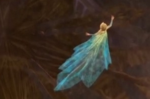
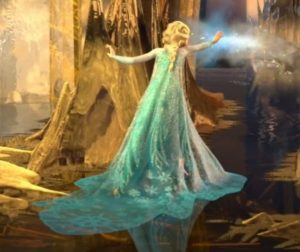
Sparkle of doom! This is so like a big torchlight solo, oh hey given the music was written by B’Way peeps this may be part of the rationale behind her Diva gown? I think of it as her Broadway Diva gown because really  Frozen follows the beats of a musical so very well.


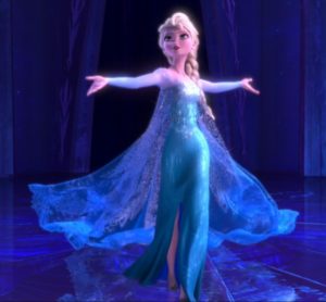
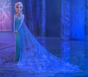
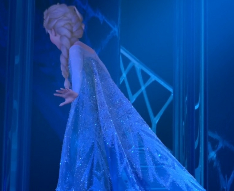
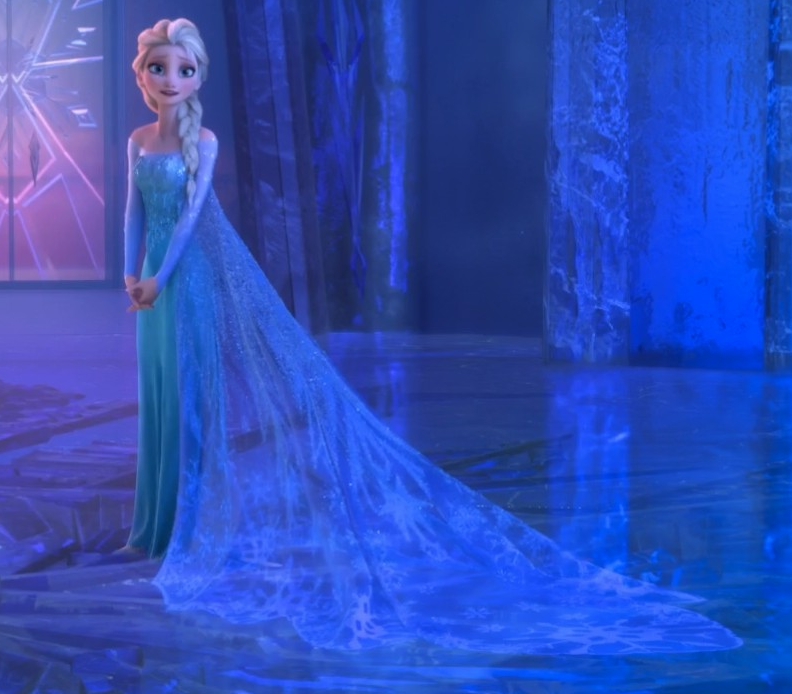
Clear view of the pointy train on the gown!


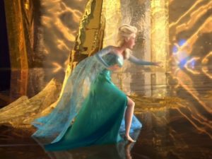
Even in very yellow light her cape and skirt are vastly different. And there is a box pleat right at the CB seam (also seen above.) It’s short but it is there. Might give that little wiggle room for hips?

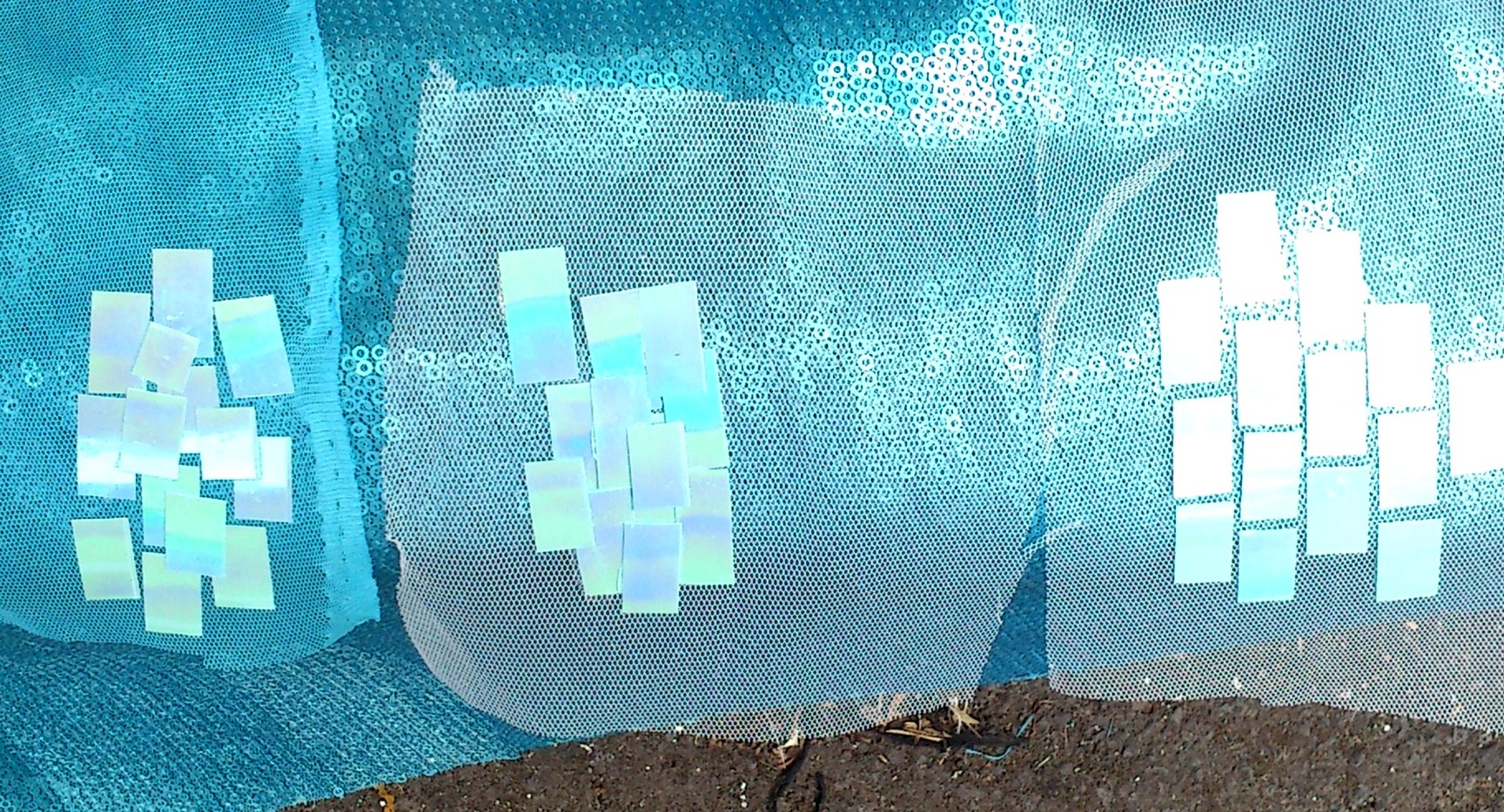
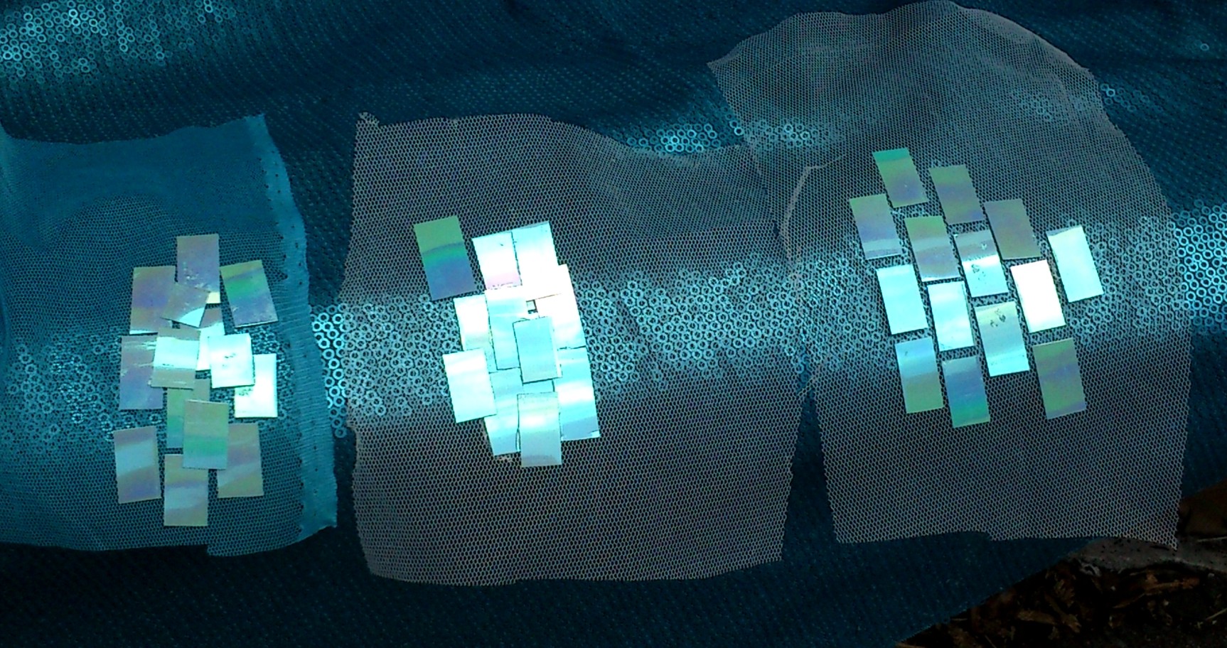
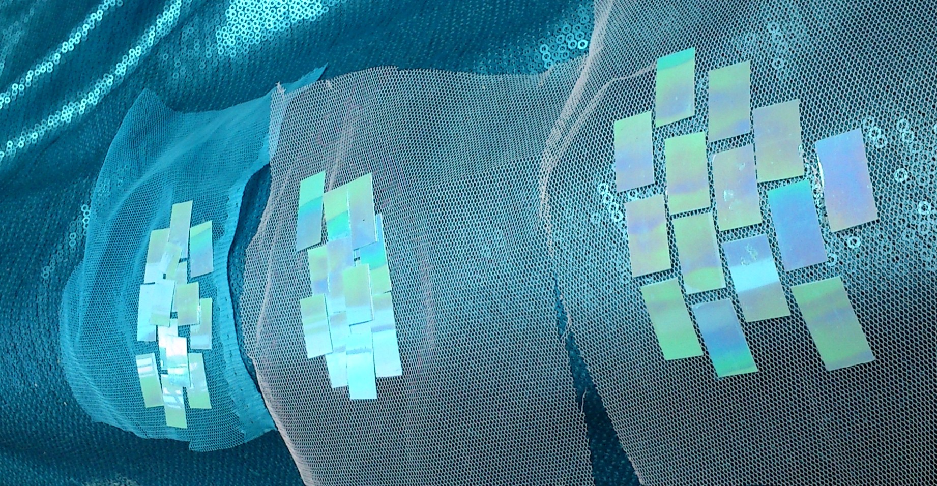
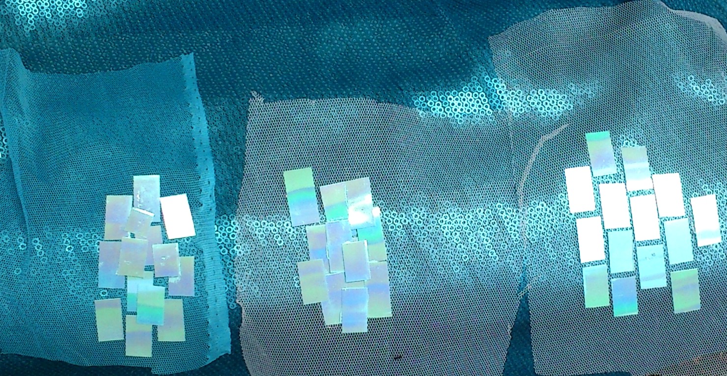
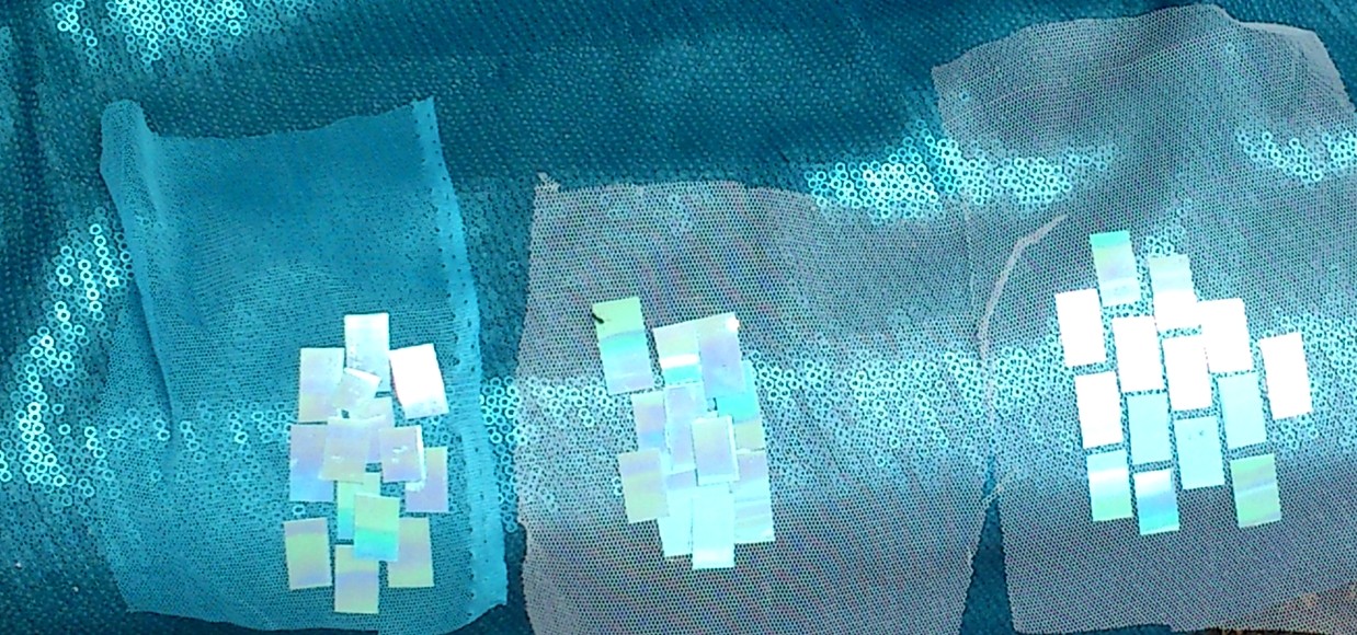
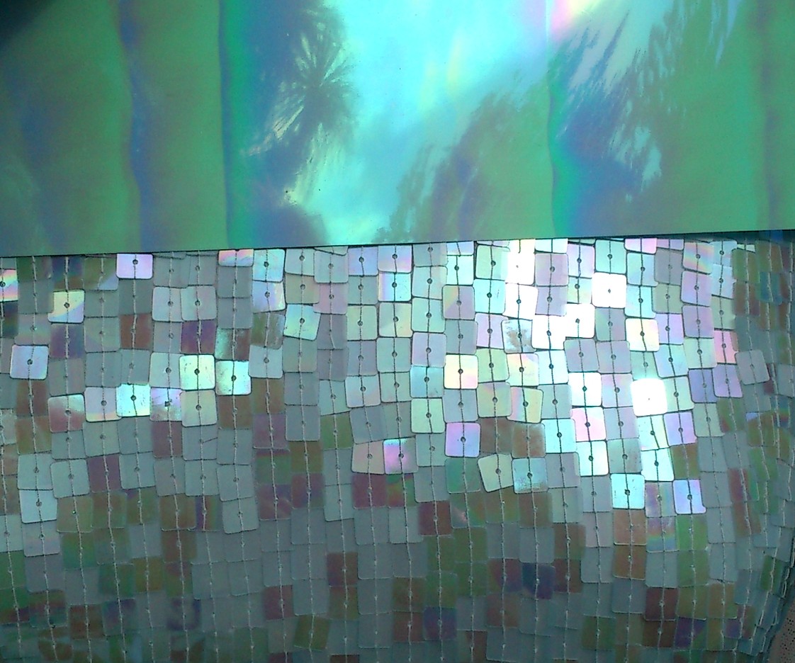
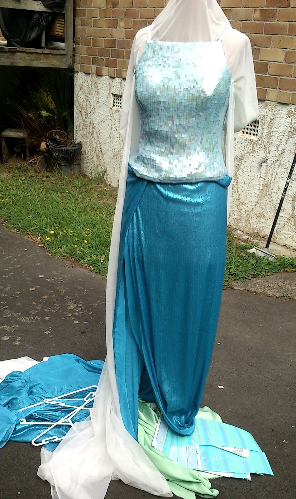
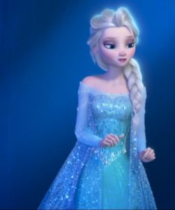
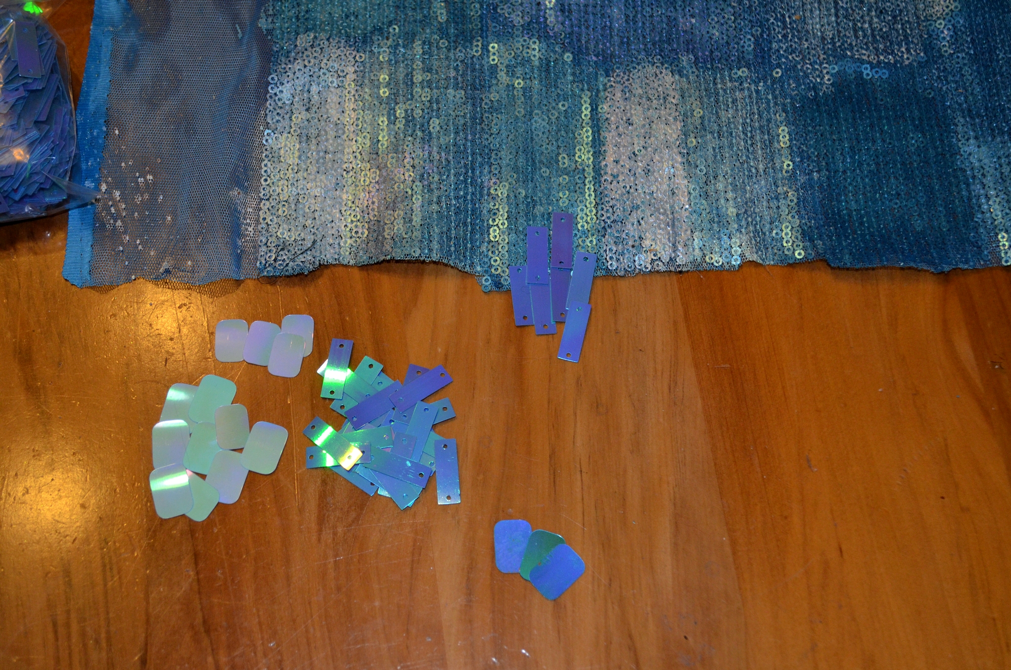
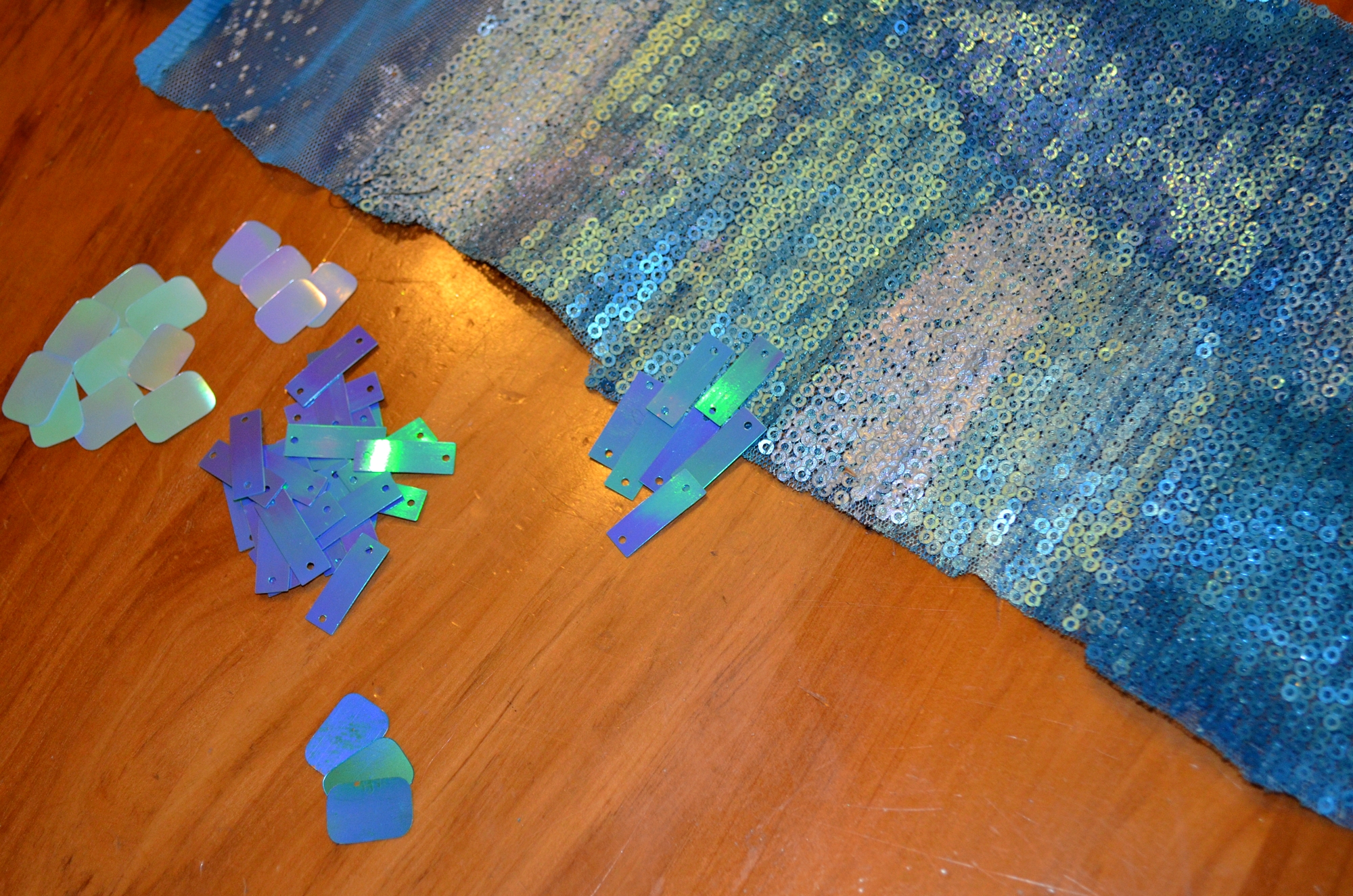
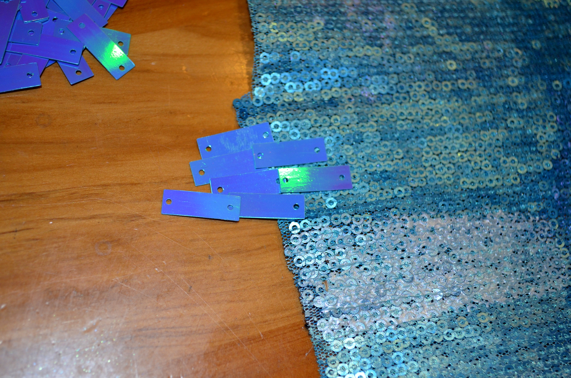
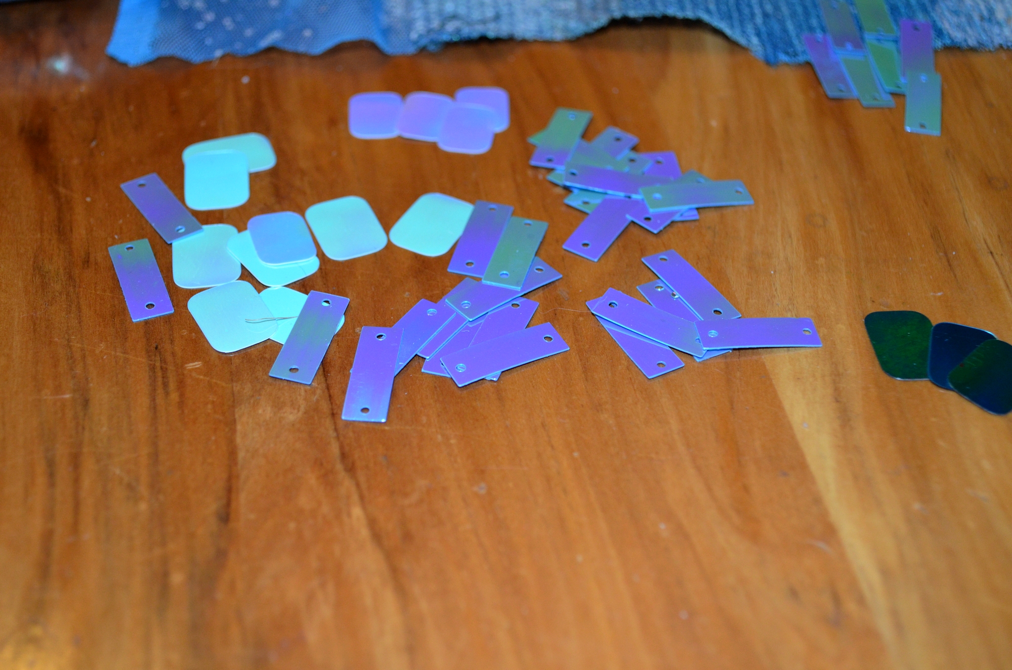
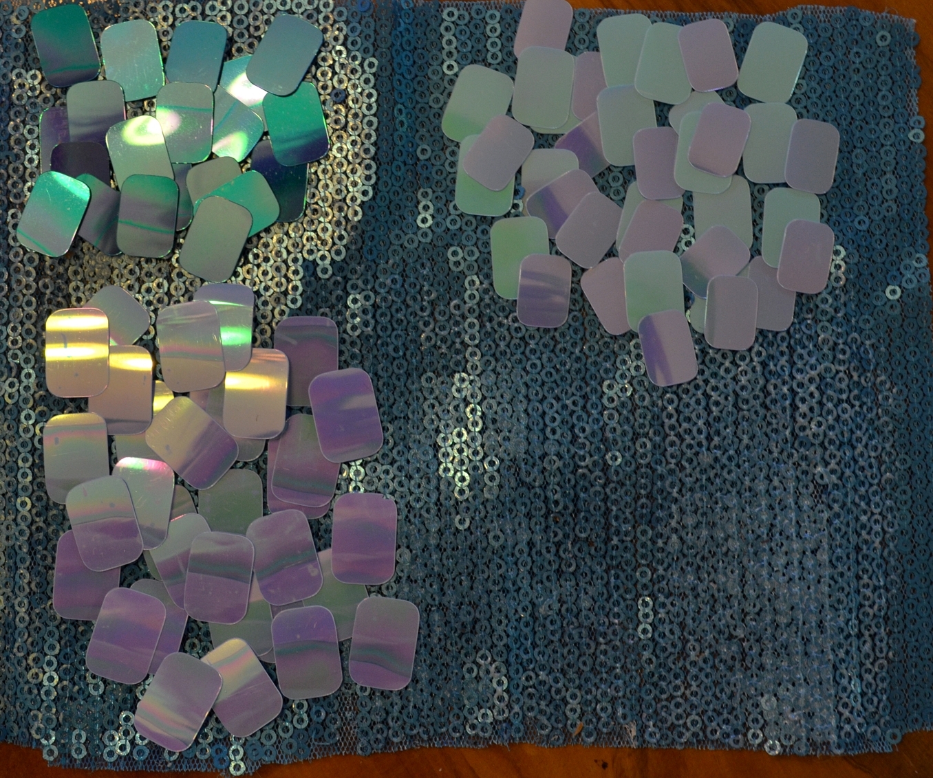
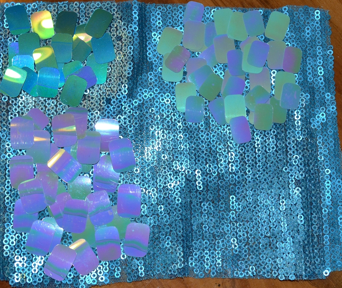
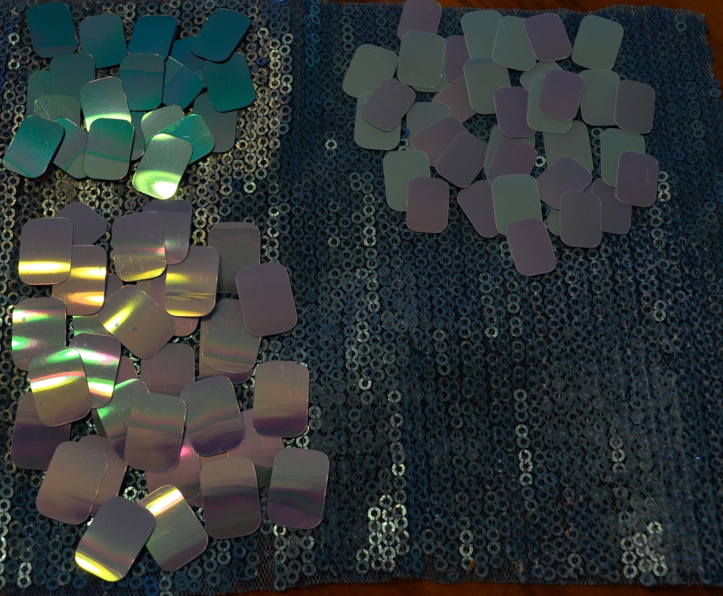
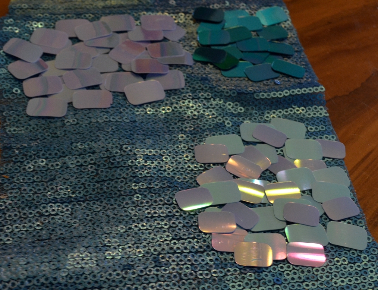
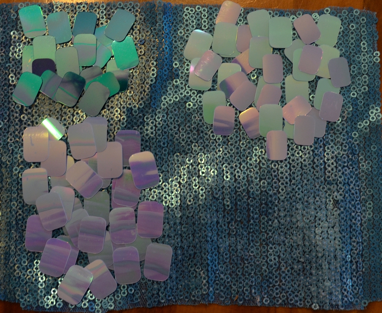
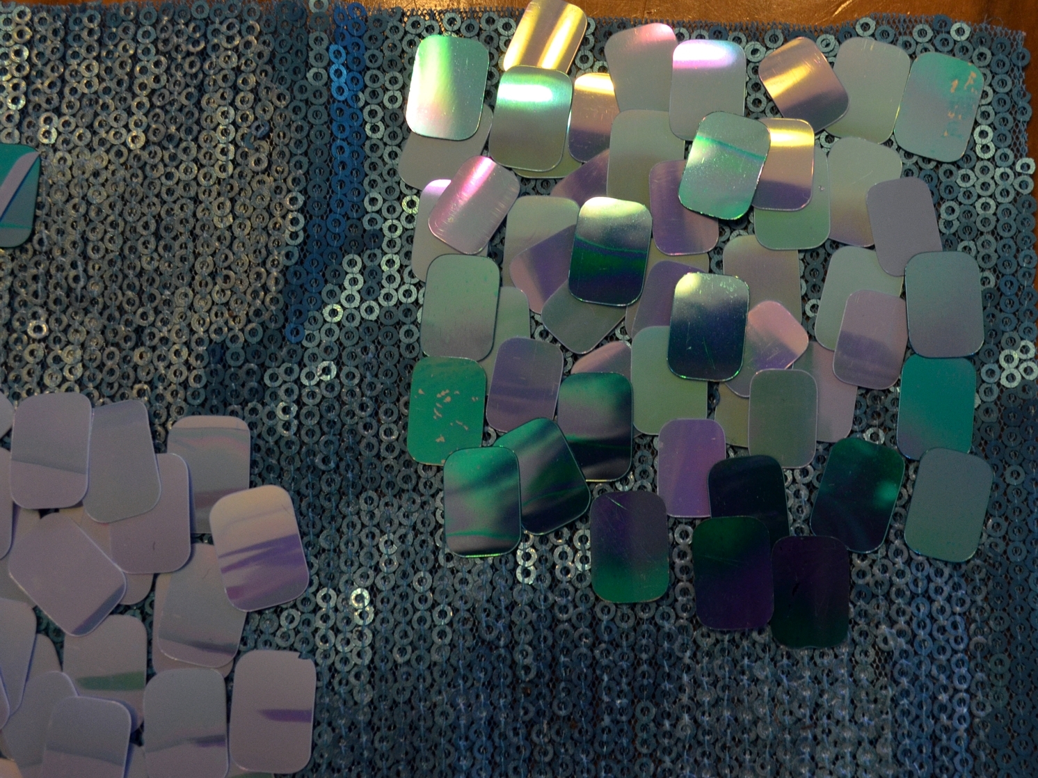
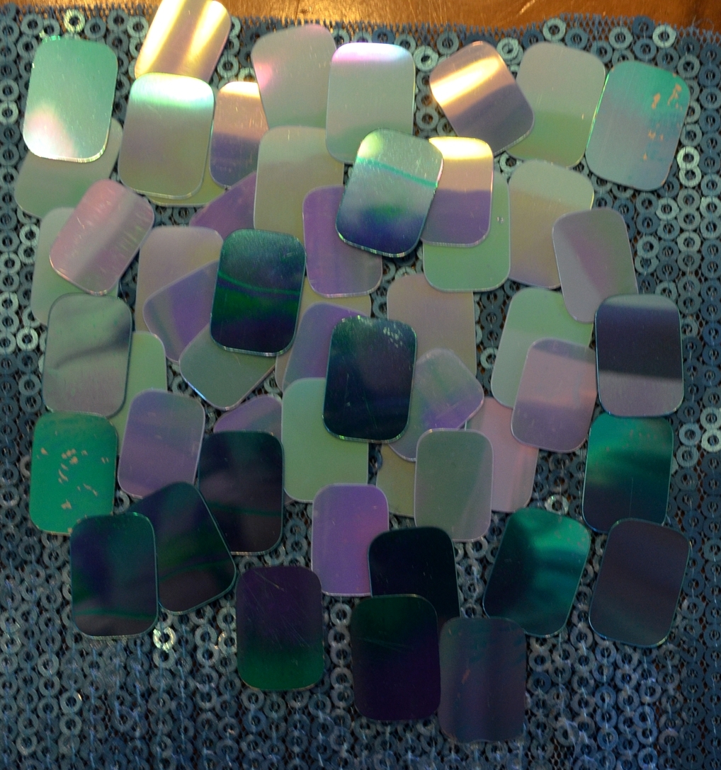
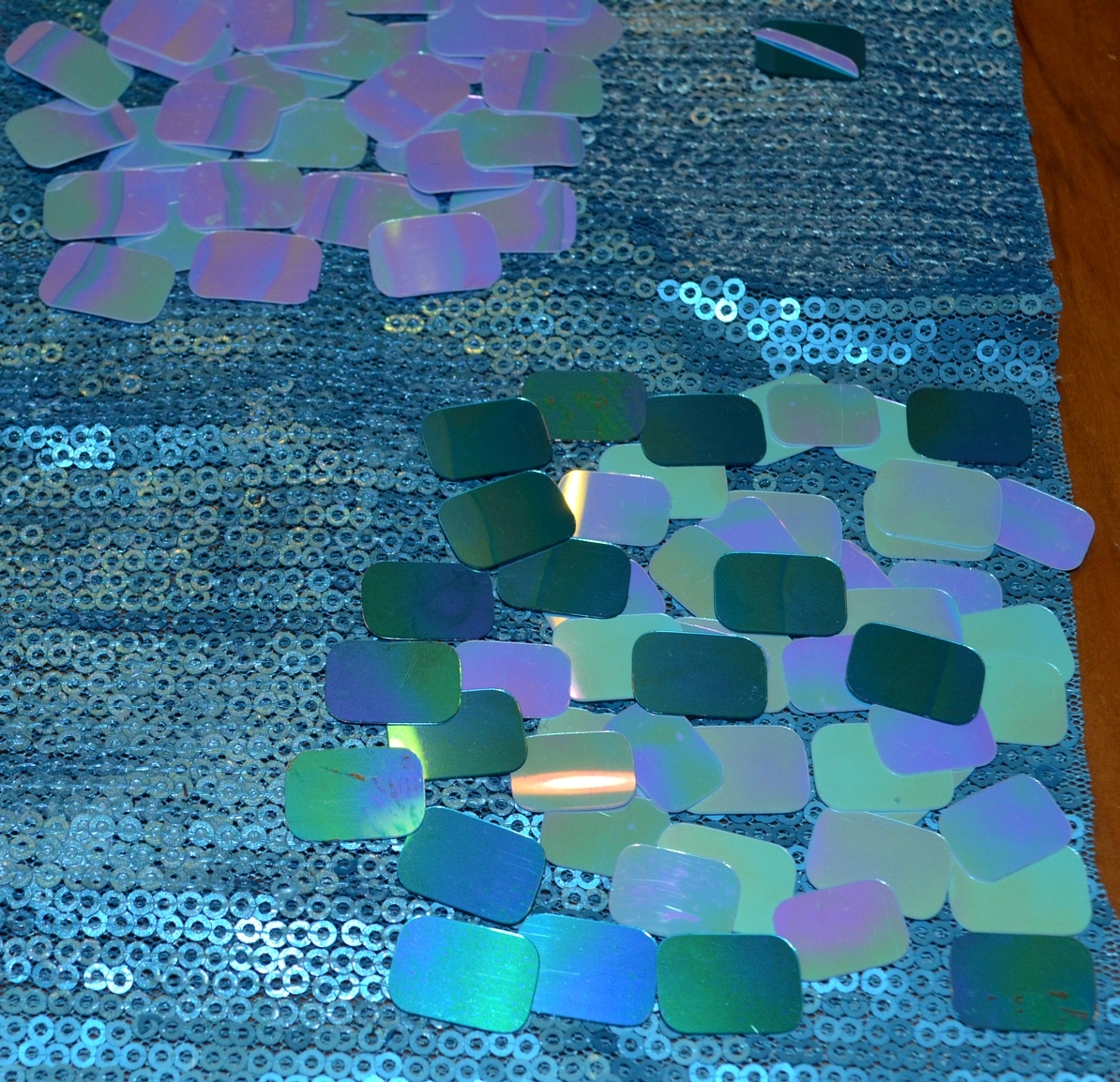
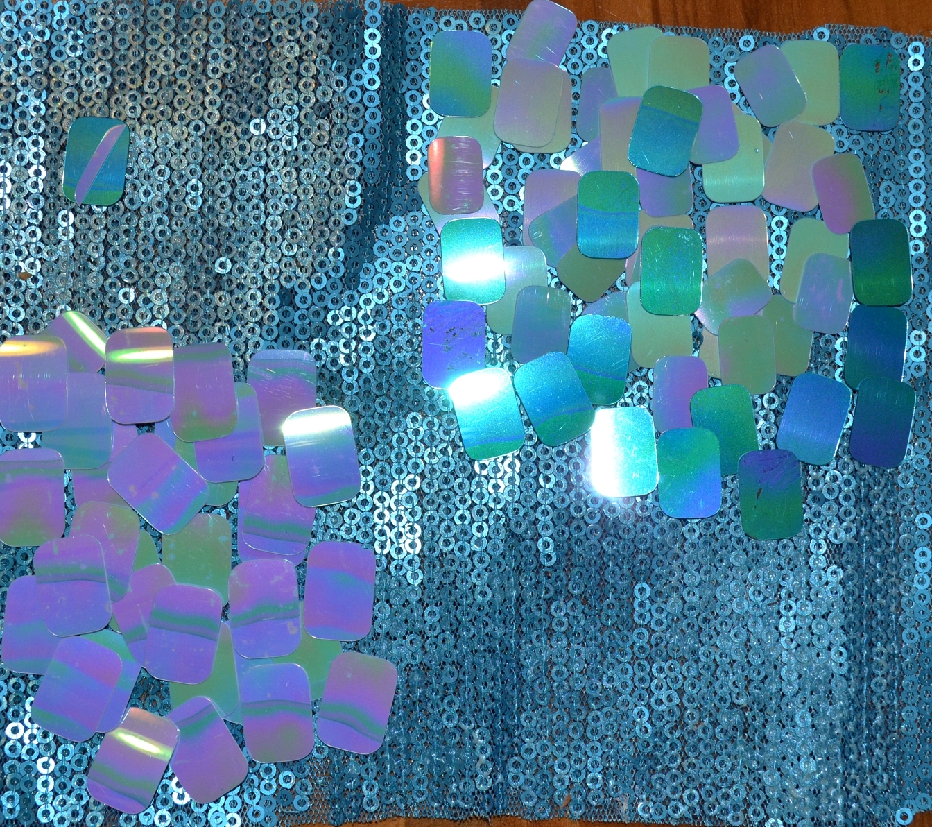
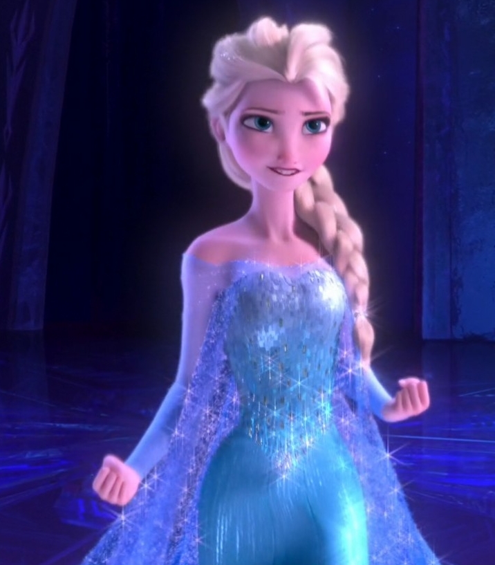
Umm hello waist seam? Yes, yes that is a waist seam clearly showing the rectangular sequins are a separate layer to the under gown. It’s a full on gown with floating ice crystals as a bodice overlay.

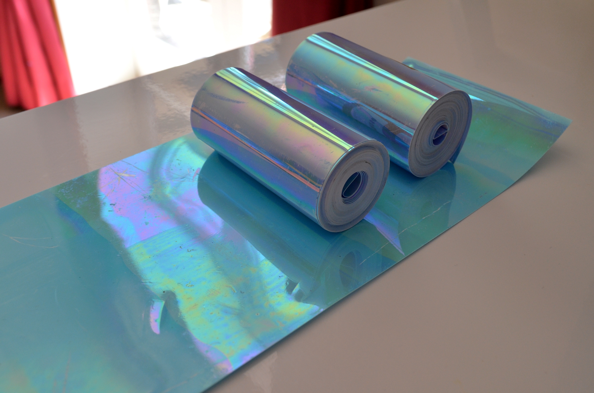
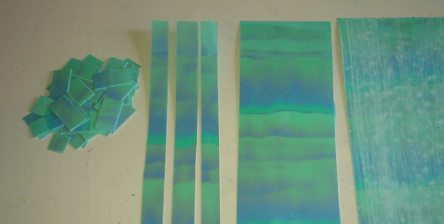
So I am very glad I bought cotton tulle as I will be able to tint it for the cape and also use it help make this sheer sequinned overlayer. I know this may be an artifact of the whole CGI process but in other scenes you can clearly see the bodice move in sync and out of sync with the skirt.


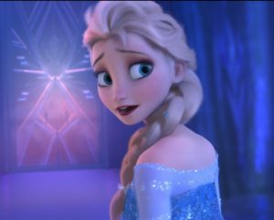
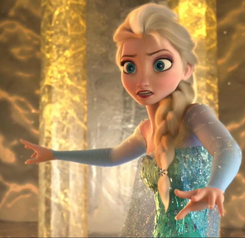
Makeup! Okay so it’s more obvious on the big screen but this is easily achieved with red interference on a cool purple. The mixing of warm and cool tones will help muddy the tone a little. I still need some interference red to try this but I have noticed with my other interference pigments this does happen.


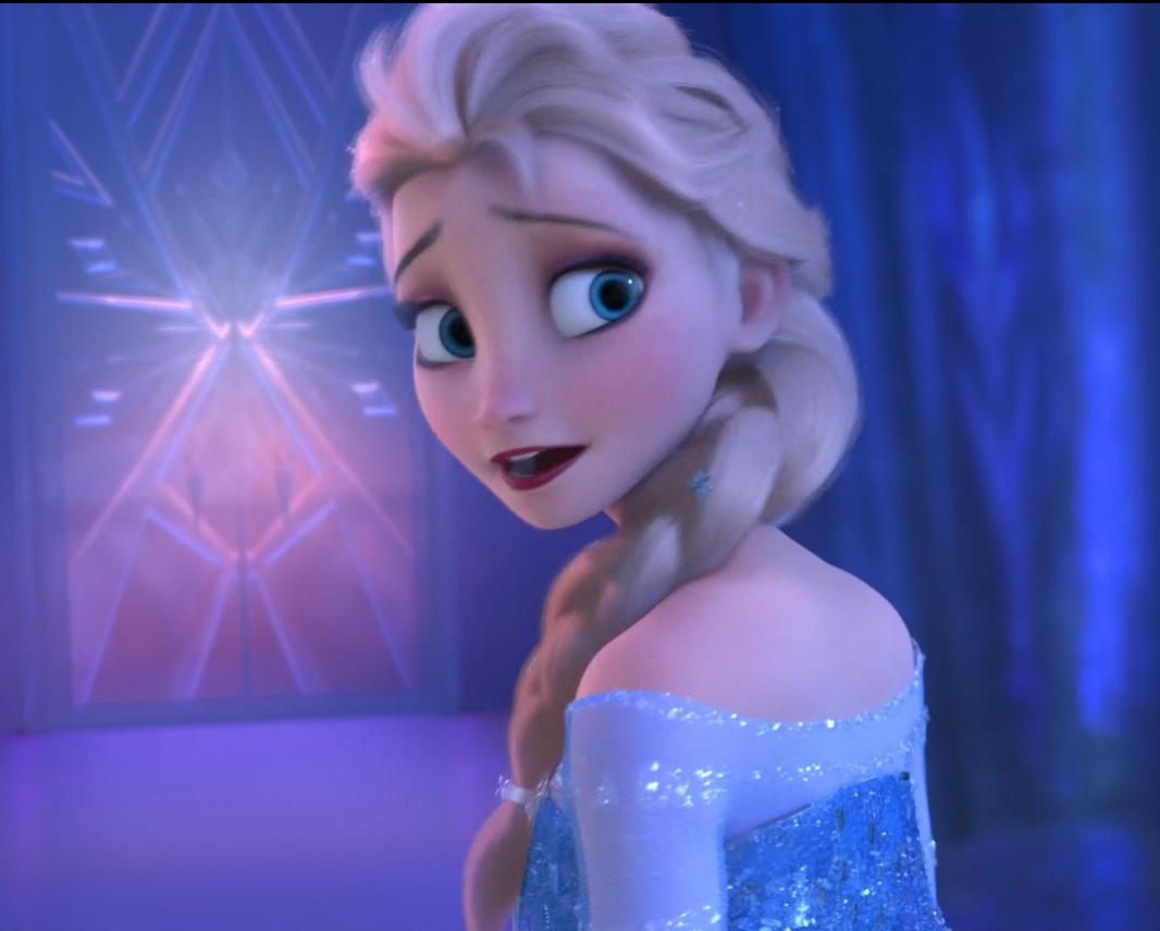
Oh look, Elsa has a tie at the end of her braid. Yes. There is a snowflake on it (which is technically the underside.)

Okay there is definitely shaping to the hem. It’s a bit hard to tell but the hem is far from a smooth line. Not sure how much is from having shaped panels- easier to show in some paper or interfacing so I will be doing some tests.

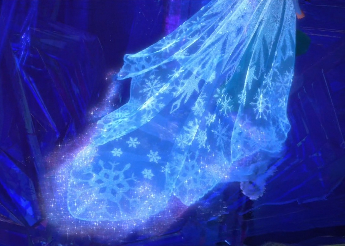
A nice clear shot of the snowflakes.

Is it wrong I see the Imperial Cog in the largest of her snowflakes? Can’t unsee it! But look at that wide opaque border of the hem.

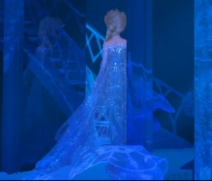
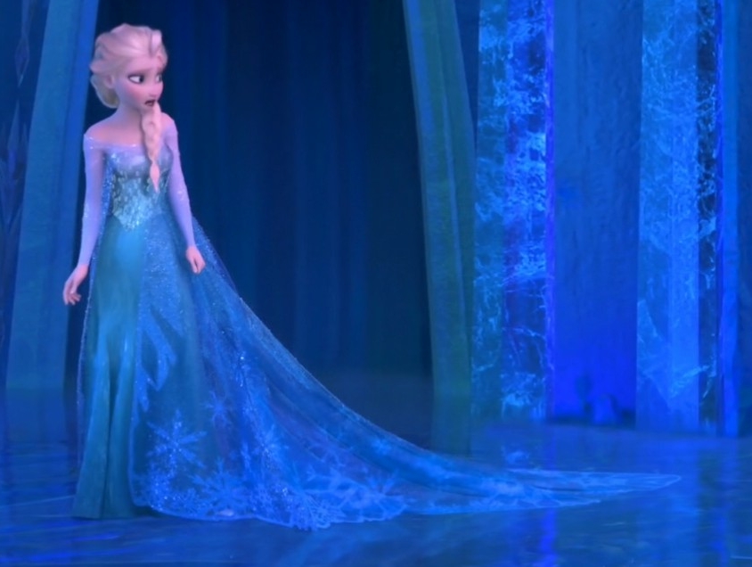
Another look at the tones!!! And a reference for the length of the train.

Check out the notches on the hem! Very clear deep points that follow the large snowflakes but also within each motif.

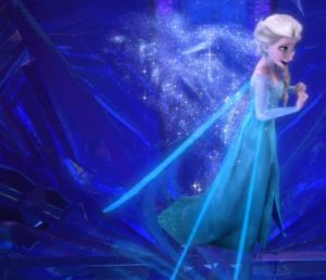
Another pointy train reference, and again the very strong difference between skirt and cape colour, her bodice overlay sort of merges the two.

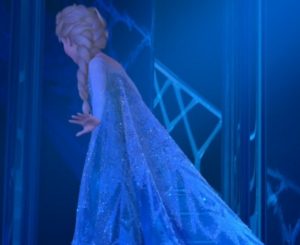
Clear view of the very high back- it even scoops up. Also nice clear line marking the top of the cape- like a row of bugles, or three rows of bugles. But it doesn’t appear at the front.

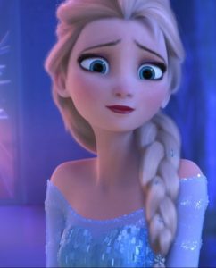
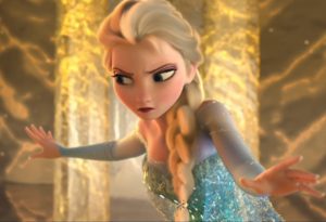
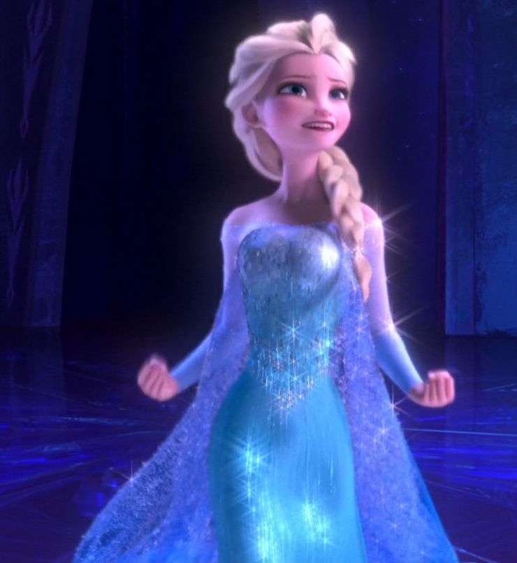
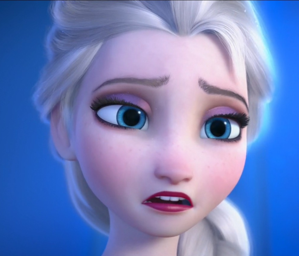
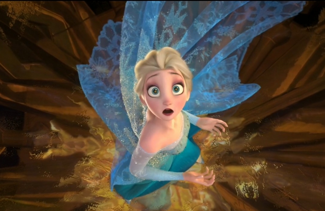
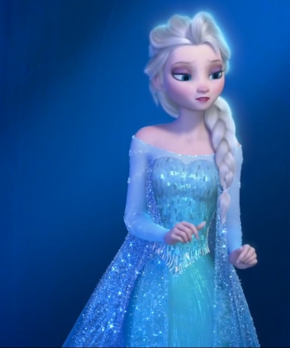
A reasonable shot showing how high the bust cups go.  Also sweetly goofy expression caught.

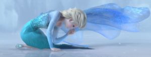
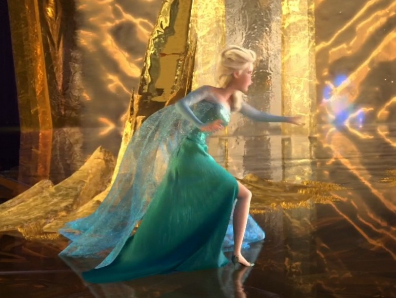
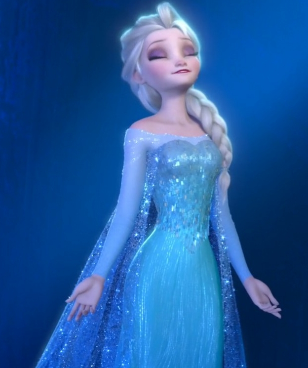
A clear view of the shape of the cape- remember how the art book says her cape defies gravity? Well here it doesn’t so she is clearly too distracted and hurting to focus. Ditto with her braid falling straight back. But you can also see how very shaped the train is to puddle like that.


The following sort of show how the bodice acts like a thin overlayer. Not how it collapses under the bust:

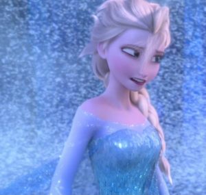
And then here is very smooth and sort of pulls up with her standing straighter. Also here you can see some of the tonal shading in the bodice- the bust is cooler and paler than towards the waist.

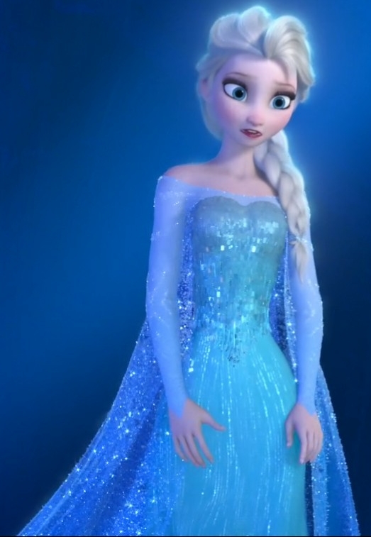
Here the waist looks like a regular pointed waist but you can see how it acts like a second overlay but how the lower edge of the bodice is incredibly thin, like it’s just the ice jewels.


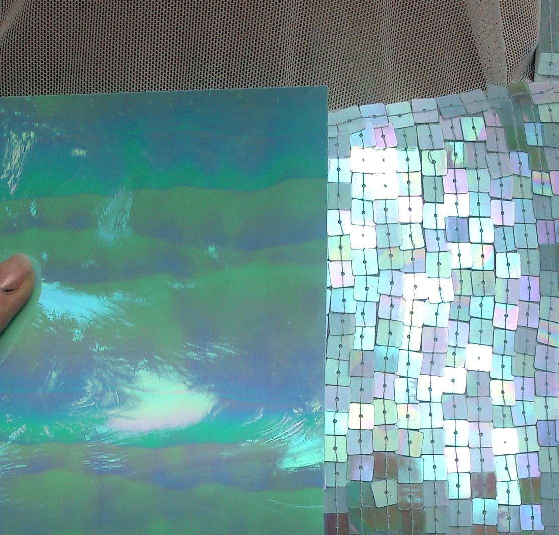
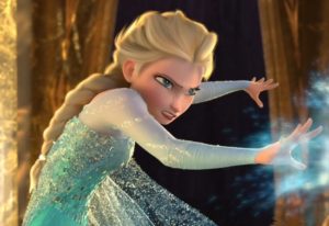
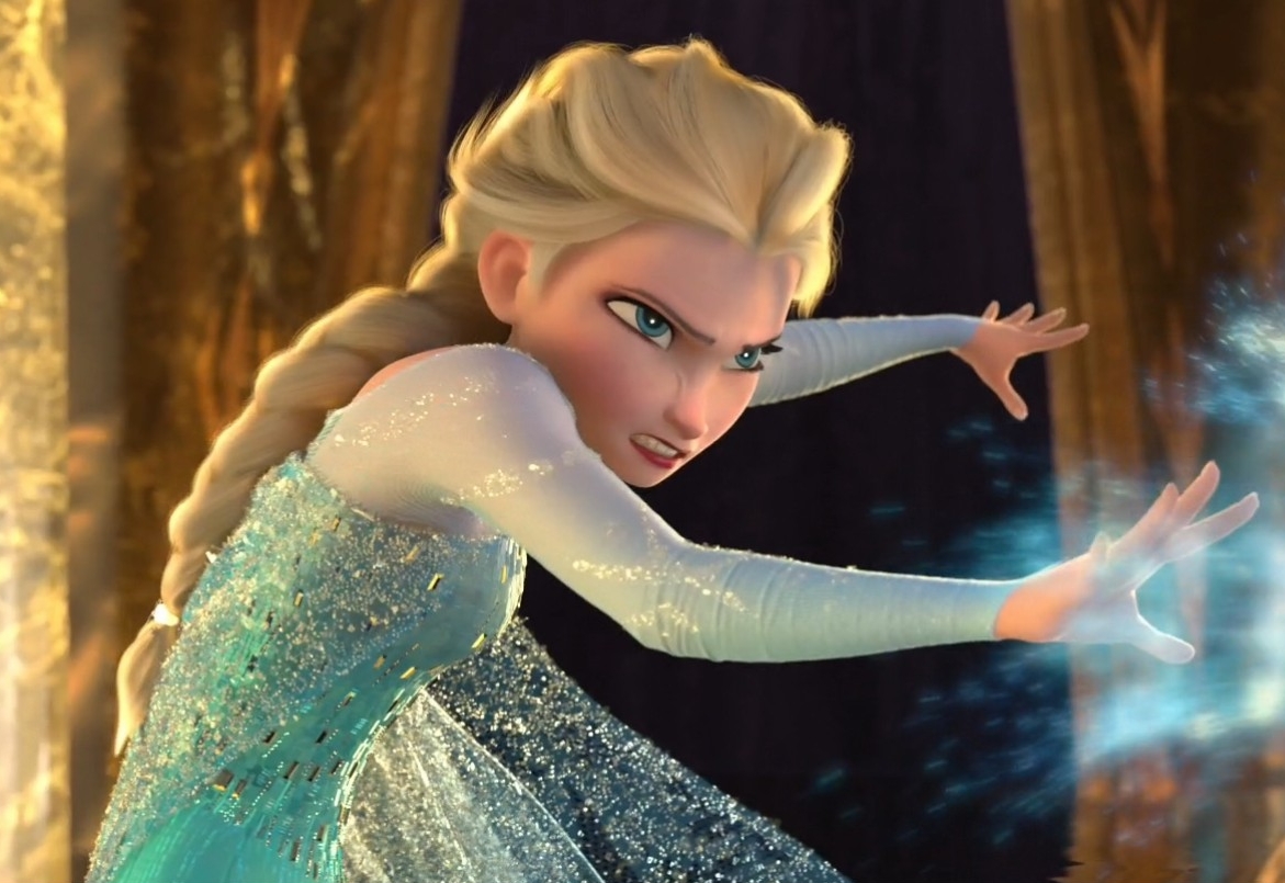
And finally a snarly Elsa with lots of lovely tone on tone details on the bodice. You can clearly see the dimension of the clear/silver ice jewels are different to the flat rectangles. Also you can see how textured the ice flurry on her cape is. There are at least three layers to the cape: net/ground, opaque patterns, and finally clear textured ice particles. The ice particles are denser at the top and the opaque patterns are the same all over.

I need to check my caps for a really good clear view of the seams of the skirt because there are several seams. Like 7 panels I think.

A few Elsa costume quotes,

So, the frozen art book has a lot of cool stuff. Of note is the tense- everything is written as if it was pre-production. So I’ll add in my conclusions below.

Giaimo put Elsa in a triangular aqua cape decorated with snowflake patterns.

I think this describes the art work which is indeed aqua. The final result is definitely not aqua-except as an overlay of light in some scenes.

“Elsa’s palette suggesta a beautiful ice crystal,” he explains. “She is a walking effect in the way those colours reflect and refract.”

Yay! Also if you look at the artwork everything that is ice is coloured- usually in the blue shades but even to pink shades. And yellow, even if Olaf thinks it’s a bad colour for snow 😉 Interesting that the yellow is most pronounced when Elsa is attacked.

“I’m attracted to colour schemes that have close analagous relationships. It creates a striking effect.”

With her subtle mauve crew-neck top, paired with her icy blue cape and warm blue dress, Elsa’s colour palette is exquisitely harmonious.”

There is a lot of info here. Colourwise this confirms her sleeves are mauve (they tint to aqua at the wrist- it’s incredibly marked in some promo artwork and washed out in others. This is why promo-artwork can be a bit of a mixed bag- the models are rendered and then there is further editing to alter colour, proportions, add more hair etc. Like you expect in image processing for real people as well.
But the colours of the cape and the dress are reversed in the final model for the film. When you look at the artwork this is indeed the colour scheme even if it is hard to see the dress underneath! (and as per the new link below from Brittney Lee, the colours are reversed for her final design).
Also interesting to see how the sleeved undershirt is defined as having a crew neck. A crew neck is supposed to fit to the neck, Elsa has a dropped shoulder/nearly off the shoulder neckline.
 

For Elsa’s cape, they want to have a crisp, almost unrealistic triangle shape to it. Gravity would probbaly dip the cape down, but they want to pull that off and not have it feel distracting.
-Wayne Unten, supervising animator

Which explains some of the rigid animation is scenes inside her palace of ice vs how it is almost in free fall towards the end of the film.
 

Early on, Mike put Elsa, once she is the snow queen, in this stunning lace cape made out of ice. That cape set the bar very high for a design sensibility, particularly for Elsa’s world, that was very beautiful but also very modern.
John Lasseter in the Preface

We have normal ice.. there there’s Elsa’s magical ice. There are two different sets of shapes and colours. Deep ice has really strong blues as opposed to thin ice, which is greys and whites.
-Cory loftis, visual development artist.

So we have Elsa’s gown and cape as deep ice and the decorations as light ice. I think we kind of know this if we’ve had a chance to see icebergs or glaciers in person or in good photos  Just nice to know this is probably part of the inspiration and thought process 

We also came up with the idea of Elsa having a signature snowflake shape. If you saw it anywhere in the movie, you’d know it wasn’t nature, it was her.
-Dan Lund, effects artist

Michael Giaimo used the word panache to describe the design sense on Frozen, and that’s Elsa to a T, stylish original, and confident. From the column dress with leg slit and train, to the ethereal frost cape that needed to be magical yet believable, to her gorgeous almost flame licked hair.
-Keith Wilson, sim lead.

Many of our samples came from the Disney Parks costume division in Fullerton, California, where we got further education and recommendations. This collaboration translated directly to the walk-around costume interpretations for Disney’s Theme Parks, when that time came. It really helps when a studio has those kind of extensive resources!”

Costume Design in Animation – Disney’s Frozen – Tyranny of Style

So yes, yes it is possible to look at the park costume and use some of their samples for ideas 

(reposting from my rpf thread 🙂 ) And adding in some quotes from Brittney Lee..

Ahah!

http://britsketch.blogspot.co.nz/2014/02/frozen-costume-design.html

I thought so! Anna does grow up between the incident and the very start of Snowman. Also Elsa has a totally different growth rate, which may also make it harder to tell the age gap between the two.

http://britsketch.blogspot.co.nz/2014/02/frozen-elsa.html

When you have fancied yourself as a bubbly mermaid for most of your life, the realization that you are actually more of a snow queen kind of hits you like a ton of ice-bricks.

This quote is more for me as I too wanted to be Ariel when I was younger 😉 I drew mermaids everywhere.  Also hey, original source!

One of the first assignments I received on Elsa was a redesign of her hair. She had initially been designed with a sharper silhouette, but as her character changed it became apparent that her style needed to be refreshed. …. Oh, and magical – it would be great if it was magical, too.

Elsa doesn’t have time to fuss with her hair – she just freezes it in place and gets on with the show.

And then there is that dress. What I wouldn’t give for someone to ice-magic me that dress. Just like Elsa herself, her dress went through many, many iterations until it finally felt right for our girl. When this dress materializes, Elsa is at her most confident. She is open and free after years of controlling and containing all of her emotions. Since costumes should be designed to support the character, this dress needed to be a glorious breathe of relief.


Oh dear… my worlds are coliding!

Ummm.. I’m looking at Elsa’s snowflakes and seeing b cells presenting antibodies… IgM is a pentamer but still, I see immunoglobulin polymers even if they don’t exist!

http://en.wikipedia.org/wiki/Antibody

Would anyone notice if I snuck an IgM in there? Pretty sure that’s from a discworld novel- a non six sided snowflake just to see… Discworld Jack Frost is a bit of a grumpy bear really….

‘I resent the implication that I am solely fern fixated,’ said Jack Frost. ‘I can also do a very nice 

paisley pattern.’

Elsa nightmare mode indeed

The colour of her cape is impossible to get. And harder to dye. I have had electric purple, sea green, dark indigo. And lavender. The lavender is the last go. It’s warm blue during the day.

Now to decide if the nylon percentage will grab a nice pure blue or if it will go more purple or to green which will muddy the tone…

The wall decal also seems a little washed out- her eyes are quite grey on my monitor so it may be a case of hunting out some printed artwork somewhere because this digital matching is not working. There are three distinct colours however so any artwork that doesn’t show this is automatically on the suspected over processing horizon 😉

I am taking in to account lighting- the final scene is perfect as we go from grey washed out white light to yellow daylight. It is very close to how my sequinned fabric behaves, though mine is too dark really.

Sigh. Turquoise idye poly anyone? Bueller? Bueller? I just need to shift this blue slightly in from the purple tone it has. Just slightly. Ever so slightly. Basically it looks great in daylight but under eco-bulbs it is really lavender. The weight of the fabric is perfect though. And so soft. So soft. I maaaaaay be able to use the last sachet of dye enhancer to bring it over the line. I’ll have to test though. Test and test and test.

Yeah, I have it next to some of the power net that went too dark and too green (all the net needs to be warm blue and the solid fabric cool) and it is a little too pale and too purple. Meanwhile the power net, that is the perfect transition colour between the mauve and aqua of her sleeves in daylight, looks like over washed white- that hint of blue from laundry powder and grey from washing with other garments.

More colour theory

As Frozen really used a lot of it (especially in regards to the ice).

http://www.huevaluechroma.com/077.php

Please note Warm blue is towards the red and cool towards the yellow. I lot of people get this back to front but yes, a green toned blue is cooler than a “true” blue!

It’s a bit of a human construct but it is how a lot of pigments are made. I used to use Chromacryl and if you mixed a cool blue and warm yellow you got a really muddy green. I need a pack anyway so I may just see if I can get some samples prepped.

Anyway, Elsa’s cape is warm toned. It is however very very sheer so that it really only shows as a shadow. Ufortunately all my dyeing has lead to a much much much too dark blue. It would be perfect if it was a bridal tulle. Very difficult to get. Also I had to go darker because my dye bath apparently dyed unevenly.

Making sequins/spangles

(Hello people coming here from tumblr! Just as an update- I am waiting on an order of similar width sequin film to test for durability and ease of use. I keep having on and off issues with being able to scratch the Shimmer Sheetz however the colour is so perfect.. So I’m also going to attempt to tone the sequin film. )

I also have an updated list of all sequins I tested:
http://www.arrayedindreams.com/costume-portfolio/fantasy/frozen-elsa/frozen-elsa-sequins/
The methods will be the same though I need a new paper trimmer as the blade has escaped and I am short sighted enough to not be able to find the inch wide bright orange piece of plastic it is attached to! I hope that the heavier density of the sequin film will allow me to sand the corners smooth as well.

Elsa is semi on hold while I work out my Maleficent DragonsDemons Daydreams but I’ll update methods here regularly, including any new glues.

http://www.arrayedindreams.com/2014/03/28/my-josyrose_tweet-sequin-film-arrived/

sm_DSC_0212sm_DSC_0213


So very similar but a little more durable.


No, not hard core stamped metal but I finally got cutting of my Shimmer Sheetz:

Shimmer Sheetz are produced by Elizabeth Crafts.

I have just ordered Turquoise as well because I think the two together will give a good gradient to the bodice. Here they are in action:

I was really worried the blue iris was too flat in colour but I also suspected that once cut the effect would be greater. And it was.  These tests didn’t even use all of the three strips I made from one sheet. Each strip is 1cm wide then cut to about 1.5-2cm with a few irregulars. I have five packets of three sheets so I should have more than enough 🙂

I’m gluing to net as I can increase sticky from underneath if need be.

The process to make them is as follows:

I scuffed the Sheetz on the reverse, this is to ensure the glue adheres. Not only is the iridescent layer laminated and so prone to pulling away but the surface is shiny. This means even the best glue it not going to grip unless it welds through- and that will lead to warping.

sm_DSC_2715 sm_DSC_2714

Then I cut the sheet in to 1cm wide strips with a handy line cutter. I am going to invest in a better one, but this was enough to get a feel for how it will cut.

Then each strip was cut into shorter pieces. Preferred length is 2cm so this gives 180 larger sequins per sheet. So 540 per pack.

At this stage I will sand the edges into rounded shapes. Not only because the artwork shows this but also to eliminate any potential extra snagging.

In the below with flash is on the left, without on the right.

sm_DSC_2722 sm_DSC_2718

I glued the pieces to two different kinds of net (the net of the sequin fabric and the old net for the cape). I tried irregular overlapping and I tried an open pattern. I prefer the open pattern, the shine really kicks through and the outlines of the background show up.

To glue I picked up each piece with angled tweezers and swept the underside over the end of an open tube of Shoe Goo (Same for E6000 or Goop) then laid and pressed the back in to the net. I used a sheet of styrene inderneath (would prefer waxed paper or sheet silicon to prevent sticking but also to allow the piece to lay flat during curing. I’d also like a roller to press the glue evenly.

So I tried from other angles and with and without flash to capture the effect.

sm_DSC_2721 sm_DSC_2720   sm_DSC_2717 sm_DSC_2716

Below are samples of the Sheetz with clear AB pale blue sequins and the base sequinned fabric.

Lined up vertical and horizontal to see which way works best.

sm_DSC_2694 sm_DSC_2693

All the fabrics before any alterations.

sm_DSC_2689


And finally just the intersection of cape, shirt and bodice and why I wanted power net and rounded edged sequins! There is a lot of friction there!

sm_DSC_2690

Elsa colours

Sigh I have been having issues with working out what colour scheme to go for. At the cinemas her gown is seriously green. However the promo artwork has been tweaked cooler to the point her sleeves look purple.

So I am aiming for this:

https://www.youtube.com/watch?v=ssVnSg2jwUw

Note how her cape clashes with her dress? Awesome. I am going to go whole hog and try for that. It hurts my brain!!! Warm tone and cool tones should not mix! but well I really like how it does clash and hurt my eyes a bit.

It’s kind of like whole tone scales. It’s weird. But it works if you Let It Go… mwahahahaha.


Also, my second piece of fabric is already heading here 🙂 Hoping like mad I got it right and that my shipping worked out. But yes. 3 yards including fedex was cheaper than two meters of similar but not as good fabric from Spotlight. That said, Spotlight clearance warehouse.. I want to be there tomorrow.. pout pout cry. They may have some furniture….